| On this page |
|
Overview 
Several different collections of information contribute to the overall definition of a digital asset:
-
The nodes inside the asset’s subnetwork.
-
The asset’s parameter interface.
-
Metadata such as the asset’s human-readable label and icon.
-
Extra files embedded in the asset, such as textures.
-
The Python implementation of the asset’s custom viewer state.
Except for the subnetwork contents, you edit all the rest using this window. As you develop an asset, you’ll open and use this window a lot, especially as you build and refine the asset’s parameter interface.
Note
Some of the information you set up when you created the asset, such as its human-readable label and the number of inputs, can be changed in this window. However, the internal name you set when you create the asset (which may include a namespace and version) becomes intrinsic to the asset and cannot be changed. If you make a mistake or want to change it, you must create a new asset.
Type properties vs. spare parameters 
You can use a similar interface to add spare parameters and/or render properties to a single node. It’s important to keep the difference between editing an asset’s node type, as in this window, and adding spare parameters to a single node.
Spare parameters are “extra” parameters added to a single node instance, which are not part of the node’s inherent parameter interface. You can add spare parameters to both assets and “factory” nodes. They are useful for one-off customizations.
Render properties are a special type of spare parameter that convey information about the node (object, camera, material) to the renderer. Most render-related nodes are created with a set of render properties that you can add to.
If you are trying to add an extra parameter to a single node, you want a spare parameter. If you are customizing rendering, you want a render property. If you want to change the base parameter interface shared by all nodes of a certain asset type, you want this window.
How to 
| To... | Do this |
|---|---|
|
Edit the type properties of an asset |
Right-click an instance of the asset and choose Type Properties. or
In the Asset Manager window (Assets ▸ Asset Manager), right click the asset definition and choose Type Properties. After you make changes in the window, you can apply them to the asset but keep the type properties window open by clicking Apply, or apply them and close the window by clicking Accept. |
Basic tab 
Label
The human-readable label for the node type. This is what Houdini shows when the node appears in the user interface, such as in the ⇥ Tab menu.
Icon
A reference to an icon file (SVG or image), in one of the following formats:
-
An
opdef:path to an embedded file in the asset’s extra files. -
A file path or URL for a file containing the icon.
-
The name of a built-in Houdini icon. For example,
OBJ_geoorSHELF_candle.
Click the chooser button next to the field to browse for an icon. You can browse for a file on disk, or click opdef:/ in the chooser to browse embedded files, or hicon:/ to browse built-in icons.
If you choose a file on disk and Embed icon in operator is on, when you click Accept Houdini will automatically copy the file into the asset’s extra files and replace the Icon field with an opdef: reference to the embedded icon.
Version
You can use this field with “upgrade handlers” to provide scripts to update old (but forward-compatible) version of a node when a new version is available. Do not confuse this field with the asset version which is part of the asset’s internal name. See the two types of asset versioning for more information.
Minimum Inputs
The number of inputs that must be connected for this node to work. The node may have more inputs than this (set by Maximum outputs below), but if the first N inputs are not connected the node will error.
Maximum Inputs
The number of inputs the node has. Note that Houdini does not check that this number is greater than or equal to Minimum inputs — You can have a node with no inputs but a minimum input count of 1, meaning it will always error.
Use controls on the Input/Output tab to give the input(s) human-readable labels.
Maximum Outputs
If the node category (for example, VOP) allows multiple outputs, this is number of outputs on the node.
Use controls on the Input/Output tab to give the output(s) human-readable labels.
Parameters tab 
A significant percentage of the work on an asset will involve editing the asset’s parameter interface, which is how users will control the asset’s options.
There are several ways to build the parameter interface.
-
Many parameters will be promoted from nodes inside the asset.
When you “promote” a parameter, Houdini creates a copy of the parameter on the asset, and replaces the original parameter’s value with an expression that references the value of the parameter on the asset. This means the parameter on the asset drives the value of the corresponding parameter inside.
For example, you might have an asset that scatters points on a surface and copies boxes onto the points. Inside the asset you, the author, will have a network with a
 Scatter node and a
  Box node, but the user will see the asset as a single node, and won’t see or interact with its contents. You will want the user to be able to control the number of points and the size of the boxes from the asset’s interface, so you would promote those specific parameters from the nodes inside onto the asset.
 -
You can create new parameters on the asset. You can set up references for these parameters manually, or use callbacks/scripting to make the parameters functional.
For example, you might want one “Size” float parameter on the asset to drive all three of a contained node’s Scale X, Scale Y, and Scale Z values. You could create a float parameter on the asset and manually set up references to it on the contained node.
-
If you are building a material, Material assets automatically create parameters corresponding to any
 Parameter VOPs inside the asset. See building a material for more information about material assets.
The Parameters tab is divided into three panes:
Create Parameters
This contains tabs representing different sources for parameters you can add to your asset. The By type tab lets you create new parameters from scratch.
Existing Parameters
This represents the node’s current parameter interface. You can drag in parameters from the left pane or the parameter editor to add to it, or drag items within the tree to rearrange it.
Parameter Description
When a parameter is selected in the middle pane, you can edit its settings in this pane.
| To... | Do this |
|---|---|
|
Promote a single parameter |
|
|
Browse for a parameter to promote |
Alternatively to dragging-and-dropping parameters, you can browse for a parameter from within the type properties window.
|
|
Create a parameter from scratch |
|
|
A button parameter lets you add a button to a node’s parameter interface that runs a Python script when the user clicks the button.
See parameter callback script for more information about |
|
When you read the value of the parameter in a script or channel reference, you will get the “token” for the currently selected item. You can also set up a parameter callback script to do something whenever the user chooses an item in the menu. Tip You can also set up a parameter that has a field for the user to type in but also a menu button they can choose possible values from. See the help for the Menu sub-tab for more information. |
|
When you read the value of the parameter in a script or channel reference:
You can also set up a parameter callback script to do something whenever the user clicks a button in the strip. Tip If you make a “Toggle” script and have the callback script turn off the selected item each time one is clicked, the button strip will act more like a toolbar of action buttons rather than a set of options. |
 Move button to move it over.
Import blocks 
An import block is a type of folder that displays its contents “inline” (that is, the enclosing “folder” is not visible).
When you are developing a set of complex assets, with high-level assets that build on low-level assets, you sometimes want to promote an entire block of parameters from a lower-level asset onto the higher-level asset you're authoring. However, you want to be able to continue to edit the lower-level parameters and not have to re-promote them every time.
Import blocks let you promote a block of parameters and have them remember where they were promoted from so you can automatically update them with changes to the originals.
Note
You still need to open the operator type properties window’s  Gear menu and choose Refresh imports to actually import or re-import the parameters.
| To... | Do this |
|---|---|
|
Promote a block of parameters as a single unit |
|
|
Manually specify import targets |
You can manually specify the Source, Token, and Mask parameters of an “import block” folder, rather than filling them in automatically by dragging in parameters. This may be useful when developing very complex nodes, where you want to craft an import block that will match the current parameters and future parameters you might add later. |
|
Refresh imports |
Import blocks do not automatically pick up changes to target’s contents. You must manually refresh the contents of the import block.
|
Parameter types 
Tip
There is no “menu” parameter type. If you want the user to choose a value from a pop-up menu, create an Integer or String parameter and then use the controls on Menu sub-tab under Parameter Description to set up a menu of value choices.
 Angle
Angle
A single float representing an angle in degrees. In old versions of Houdini this had a different UI than a plain float but this is no longer the case.
 Button
A clickable button. You can enter a script to run when the user clicks the button.
 Button Strip
A horizontal strip of labeled options. The buttons can be mutually exclusive or individually set. See how to create a button strip parameter above, and how to write a button strip callback.
 Color
Color
A 3 float vector parameter with a UI for editing the value as a color. Channels use the suffixes rgb instead of 123.
 Color and Alpha
A 4 float vector parameter with a UI for editing the value as a color with alpha channel. Channels use the suffixes rgba instead of 1234.
 Data
Data
Stores custom data types. The parameter has no UI, you must read or write the value in a script. This parameter type is intended for HDK developers wishing to stash custom data on a node instance.
 Direction Vector
A 3 float vector representing a direction. In old versions of Houdini this had a different UI than a plain vector but this is no longer the case.
 File
File
A string representing a file path, with a UI for choosing a file from disk.
 File - Directory
A string representing a directory path, with a UI for choosing a directory from disk.
 File - Geometry
A string representing a path to a geometry file, with a UI for choosing a file that filters out non-geometry files by default.
 File - Image
A string representing a path to an image file, with a UI for choosing a file that filters out non-image files by default.
 Float
Float
A single floating point value.
Float - Mono
A single floating point value with a UI for editing the value as a mono color.
 Float Vector 2
Two floating point values.
 Float Vector 3
Three floating point values, for example a 3D position.
 Float Vector 4
Four floating point values, for example a quaternion.
 Folder
A container for other parameters. Folders let you organize the node’s parameters. You can choose to present the folder in different ways, such as a tab, group box, or collapsible section. Adjacent tabs join together automatically.
See Folder settings.
 Geometry Data
Stores arbitrary geometry data. The parameter has no UI, you must read or write the value in a script. This can be useful for stashing geometry on a node instance. For example, you could use this to make the  Stash SOP.
 Icon Strip
Like Button Strip but with icons on the buttons instead of text labels. The buttons can be mutually exclusive or individually set. See how to create an icon strip parameter above, and how to write an icon strip callback.
 Integer
A single integer value.
 Integer Vector 2
Two integer values.
 Integer Vector 3
Three integer values.
 Integer Vector 4
Four integer values.
 Key-Value Dictionary
Stores a table of string → string associations.
 Label
Label
A read-only line of text.
 Logarithmic Float
A single float, but the slider UI affects the value on exponential scale.
 Logarithmic Integer
A single integer, but the slider UI affects the value on exponential scale.
 Min/max Float
Two floats representing a low and high. Channels use the suffixes min and max instead of 1 and 2. Nodes with a parameter of this type will not load in Houdini versions before 16.0.
 Min/max Integer
Two integers representing a low and high. Channels use the suffixes min and max instead of 1 and 2. Nodes with a parameter of this type will not load in Houdini versions before 16.0.
 Operator List
A string representing a space-separated list of node paths, with a UI for choosing multiple nodes.
 Operator Path
A string representing a node path, with a UI for choosing a node.
 RGBA Mask
An integer bitmask created from a UI allowing the user to turn each of a red, green, blue, and alpha button on or off individually.
 Ramp (Color)
A three float vector with a color ramp UI. You can sample the ramp in an expression with chramp.
Ramp (Float)
A single float with a curve ramp UI. You can sample the ramp in an expression with chramp.
 Separator
Inserts a separator line into the UI to organize the parameters.
 String
A text box for editing a string value.
See built-in tags and String settings.
 Toggle
A checkbox for editing a boolean value.
 UV
UV
Two floats representing surface coordinates. Channels use the suffixes uv instead of 12.
 UVW
UVW
Three floats representing surface coordinates. Channels use the suffixes uvw instead of 123.
Parameter tags 
Common settings 
Name
The internal name of the parameter. This is how channel references and scripts refer to the parameter.
Label
The human readable label for the parameter. This is what appears next to the parameter’s UI in the parameter editor. You can turn off the checkbox to not show any label next to the controls.
Type
The parameter type. This affects how the value is stored and how the parameter is presented to the user in the parameter editor interface.
Invisible
When this is on, the parameter is not shown in the parameter editor, but you can still read and write its value using expressions and scripts.
By default, invisible parameters are not shown under Existing parameters. If you want to show them so you can select them, rearrange them, and delete them, turn on Show invisible parameters at the top.
Horizontally join to next parameter
Put this parameter and the next parameter in the same row in the parameter editor interface. Note that you can turn this on for more than one parameter in a row to layout three or more parameters horizontally. If all the “joined” parameters can’t fit in a line, they will wrap to the next line.
-
When you have 2 or more related, compact controls in a row, you can join them to save space.
-
You can make a checkbox, turn its label off, and “join” it to the next parameter, for a UI where the checkbox controls whether the parameter applies or not, similar to the Label control in this pane. (Note that you still need to actually implement that UI using expressions.)
Show parm in
There can be a few different parameter interfaces in Houdini. This controls which of these different interfaces this parameter appears in.
Main Dialog Only
Parameter only appears in the parameter editor.
Main & Tool Dialogs
Parameter appears in the parameter editor and the floating parameter editor in the viewer.
Main & Tool Dialogs + Toolbox
Parameter appears in the parameter editor, and the operator toolbar across the top of the viewer when the node is active, and the floating parameter editor in the viewer.
Disable when
A rule for when this parameter should appear disabled/non-editable. This lets you set up parameters to dynamically disable based on the value of other parameters. See disable/hide when syntax.
Hide when
A rule for when this parameter should not appear. This lets you set up parameters to dynamically hide themselves based on the value of other parameters. See disable/hide when syntax.
Callback Script
Houdini will runs this script when the value of this parameter changes.
The pop-up icon menu to the right of this field lets you set whether the callback script is in HScript command language or Python.
If the value in the field is one line, it is treated as a Python expression and evaluated. If it has more than one line, it is treated as if it was the body of a function and must use a return statement at the end to return a value.
The script runs in an environment containing a kwargs global dictionary variable containing information about which parameter changed.
See parameter callback scripts for more information.
Send UI Changes to Callback
Triggers the Callback Script when you perform certain actions on parameter interfaces that don’t change the parameter’s value. For example, when you change the tab viewed on a tabbed multiparm. See UI Callbacks for more information.
Available for import
If you turn this off, this item will not be included when its parent folder is imported as a block.
Help
This is displayed as a tooltip when the user hovers over the parameter.
String settings 
Multi-line string
Display this field as a multi-line editor instead of a single line text field.
Note that all string parameters can hold multi-line text. You can get an extended multi-line editor for a single line text field by pressing Alt + E in the field. This checkbox simply changes the look/capabilities of the user interface for editing the sting.
Lines to Show
When Multi-line string is on, this is the minimum and maximum number of lines to show in the editor. The field will always be the minimum number of lines tall. If the content has fewer lines than the maximum, the field automatically sizes down to fit, and expands as the user types more, until the content has more than the maximum lines to show, at which point the content will scroll.
Language
If the field will contain source code, you can specify a programming language to enable auto-completion and syntax highlighting in the field.
Suppress Quotes in VOP Code Blocks
Whether this parameter should be expanded without quotes within VOP code blocks. A common use is to allow strings from menus to be placed verbatim in a code block. Only available for string parameters in a VOP definition.
Numeric settings 
Units
Specifies a unit type for this parameter’s value, such “distance” or “mass”. Choose a unit type from the pop-up menu to the right of the field, or leave this field blank if this value should not scale with a change in units.
This tells Houdini whether/how to scale the parameter’s default value when the user changes the HIP file’s units. For example, if the user changes the HIP file’s units to cm, it will use this setting to scale any defaults related to length/distance.
The code uses the format ‹m/kg/s›‹exponent›[‹m/kg/s›‹exponent› ...]. For example, length would be m1. Acceleration would be m1s-2 (that is, meters/seconds2, using a negative exponent instead of division). The following are some useful unit type specifications:
Mass |
|
Time |
|
Velocity |
|
Angular velocity |
|
Acceleration |
|
Angular acceleration |
|
Force |
|
Force density |
|
Impulse |
|
Torque |
|
Drag |
|
Angular drag |
|
Pressure |
|
Spring constant |
|
Linear density |
|
Area density |
|
Volume density |
|
Size
When Type is Integer, Float, or Angle, sets the number of components in the parameter (1 to 4).
Defaults
The default value for the parameter. If Size is greater than 1, a default can be specified for each component.
Range
The range for the slider in the interface.
If you click the lock icon next to low and/or high value, the interface prevents the user from manually entering values lower and/or higher than this range.
Node path/list settings 
Op filter
Filters which types of nodes the user can see and select in the chooser interface for this parameter.
For example, if the parameter requires the path to a bone, you would set this to “Object: Bone Only” to make it easier for the user to select from just the bones in the scene.
File settings 
Browse Mode
For operating systems that have a different file chooser UI depending on whether you're opening or saving a file (such as MacOS), this lets you specify which type of operation is associated with this parameter.
For example, in a parameter that specifies a geometry file to load, you would set this to “Read Only”. For a parameter that specifies an output file to write to, you would set this “Write Only”.
Houdini’s file chooser currently does not use this information. This only makes a difference if you are using native file dialogs (you have set the HOUDINI_USE_NATIVE_FILE_CHOOSER environment variable) and the native file dialogs make this distinction (as on MacOS).
Folder settings 
Folder type
How the parameter editor displays this group of parameters in the parameter editor.
Collapsible
Display as a collapsible heading containing the parameters. See heading interfaces below for more information.
Simple
Display as a labeled box around the parameters. See heading interfaces below for more information.
Tabs
Display as a tab. Multiple adjacent “tab” folders in the parameter tree display as a tab set in the parameter editor.
Import Block
Displays its contents as part of the normal parameter flow. This is useful when you are importing a folder as a block but don’t want the parameters to appear inside a tab or whatever other folder type you're importing.
Multiparm Block
A multiparm lets you dynamically create multiple instances (copies) of the contained parameters. This folder type sets up an interface to let the user add parameters. The parameter(s) inside this folder act as the template for the generated parameter blocks the user can add or delete. See Multiparms for more information about how to use multiparameters.
“List” style adds the user-generated blocks as part of the normal parameter layout in the parameter editor. “Scrolling” style puts the user-generated blocks inside a scrolling area. “Tabs” puts each user-generated block in a separate tab in a set.
Add a Multiparm Label Reference (Multiparm Block) spare parameter (tag) in a Multiparm Block folder and set it to a parameter name to designate that parameter as a dynamic label (for example, sidefx::multi_label, tablabel#). This adds a parameter in the multiparm block that lets you give each list, scroll, or tab instance a unique name identifier. As of H21.0, this spare parameter is used in some nodes (such as Muscle Tension Lines Activate) to support custom user-set labels on multiparameters.
Note
The tab on a tabbed multiparm instance displays its current index. This means that moving or adding instances into a middle tab changes the tab names of later instances without affecting their contents. An exception to this is when the tabbed multiparm has a custom label set (Multiparm Label Reference (Multiparm Block)), which makes the tab labels move along with their contents.
End tab group
Adjacent “tab” folders are merged into a tab set. If you want a series of tabs to be in different tab sets, turn this on for the last tab in each set. It indicates this is the last tab in its set and if the next item is also a tab it should start a new set.
Tab disable when
A rule for when all parameters in this tab should appear disabled/non-editable. See disable/hide when syntax.
Tab hide when
A rule for when this tab should be hidden. See disable/hide when syntax.
Import settings
Turn this on have this folder import its contents from a folder on a node inside this asset. See import blocks.
Note
You still need to open the operator type properties window’s Gear menu and choose Refresh imports to actually import or re-import the parameters.
Source
A reference to the node or file this folder imports its contents from, when Import settings is on.
The source can be either a sub-node, specified using op:‹node_path›, or an external dialog script, specified using file:‹file_path›. For example, to import parameters from a node named torus1 inside the asset, use op:torus1. To import from a node named sphere1 inside an object named geo1 inside the asset, use op:geo1/sphere1.
Token
The name of the item to import from the node/file, when Import settings is on. You can import a folder, an import block, or all the parameters from the source.
-
To import a folder, use the Name of the folder.
-
Tab sets are sibling folders that share the same Name. To import the all tabs in a tab set, use the shared Name as the token. To import a single tab from a group, use the Name of the tab set, followed by a colon (:), followed by the Label of the folder you want to import.
For example, to import a tab named
folder1with the label “Shading”, the token would befolder1:Shading. -
To import an import block, use the special token
importblock, followed by a colon (:), followed by the Label of the import block you want to import. -
To import all the parameters from the source, leave the token blank.
To get the name of a folder, select the source node, and in the parameter editor, open the Gear menu and choose Edit Parameter Interface. Then select the folder in the Existing parameters and check the contents of the Name field under Parameter description.
Mask
Only import parameters matching this pattern, when Import settings is on.
-
Excluding a multiparm will not automatically exclude any existing instances (you should craft the pattern so it excludes both the “parent” multiparm name and instance names).
-
Including a multiparm will automatically exclude any individual instances.
Heading interfaces 
The “Collapsible” folder type (shown as a collapsing header in the parameter editor) has several options that let you design a more compact and clear parameter interface.
In-header checkbox 
(This works with Simple and Collapsible folder types.)
Often, a collapsible parameter section will contain options for a single feature that can be on or off. For example, you might have a checkbox to turn “Simplify Geometry” on or off, and then a set of options related to simplifying geometry.
You can add a tag so the checkbox is shown as part of the collapsible header. This is more compact, makes the checkbox’s relationship with the section visually clear.
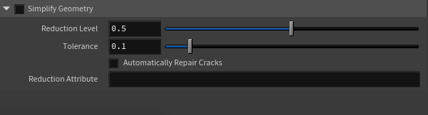
To merge a checkbox into a collapsible header, do the following:
-
Add a checkbox (“Toggle” type parameter) to the parameter tree.
-
Add a folder below the checkbox. Set the Folder Type to Collapsible.
Note
The toggle parm must be outside the collapsible folder in the parameter hierarchy.
-
In the folder’s Parameter Description, on the Parameter tab, click Built-in Tags (below the tag table). In the pop-up dialog, select Standard Tags ▸ Parameter Folders ▸ Header Toggle Reference, then click Accept.
-
In the Tags table, click the empty cell next to
sidefx::header_toggle. Type the internal name of the toggle parameter, then press Enter. -
To disable all parameters in the collapsible section when the main toggle is off, set the collapsible folder’s Disable When option to:
{ ‹toggle_internal_name› == 0 }(This is why the toggle must be outside the collapsible folder, so it can control the state of all options inside the folder.)
-
Click Apply in the type properties window to see the effect on the parameters.
Tip
The header displays the label of the folder, not the checkbox.
In-header parameter 
(This works with Collapsible folder types only.)
There may be one parameter in a collapsed section that is more commonly accessed than all other parameters in the section.
You can add a tag so that parameter is shown in the header when the section is collapsed, so the user can always edit that parameter even when the other parameters in the section are hidden.
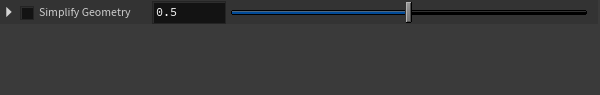
Note
The collapsed header displays the label of the folder, not the parameter. This means for usability, it must be very obvious to the user what the parameter represents. Before you use a header parameter, ask yourself if it makes sense for the parameter to have the same label as the parent folder.
For example, if a Scatter-type node has a collapsing section labeled Density, then it makes sense for the header parameter to be a slider that scales overall point density (the other parameters in the section might control how the density is computed, distribution, units, and so on). Similarly, if a section is named Texture, it makes sense for the collapsed parameter to be a file path to the texture file.
To specify a parameter to display in a header when collapsed, do the following:
-
Select the “Collapsible” folder in the parameter tree.
-
In the folder’s Parameter Description, on the Parameter tab, click Built-in Tags (below the tag table). In the pop-up dialog, select Standard Tags ▸ Parameter Folders ▸ Header Parameter Reference, then click Accept.
-
In the Tags table, click the empty cell next to
sidefx::header_parm. Type the internal name of the parameter inside the folder you want to display, then press Enter. -
Click Apply in the type properties window to see the effect on the parameters. (Note that the parameter only appears in the header when it’s collapsed.)
In-header collapsing 
(This works with Collapsible folder types only.)
Collapsible folder types are either initially expanded or collapsed in the parameter editor. You can add a tag to adjust this default setting in the Operator Type Properties window.
To change a Collapsible folder’s default so it shows or hides its parameters, do the following:
-
Click the Parameters tab in the Operator Type Properties window.
-
Click the Collapsible folder you want to edit in the Existing Parameters section.
-
Click Built-in Tags in the Parameter Description section. The Choose Parameter Tag window opens.
-
Expand Standard Tags ▸ Parameter Folders.
-
Click one of the following to set the default:
-
Collapsible Folder Initially Closed (initially collapse the folder and hide its parameters)
-
Collapsible Folder Initially Open (initially expand the folder and show its parameters)
-
-
Click Accept.
-
Click Apply in the Operator Type Properties window to preview the new default.
-
Click Accept to accept the changes.
Ramp settings 
Ramp type
This can be “Color” for a color ramp or “Float” for a scalar curve ramp.
Color type
When Ramp type is “Color”, this specifies the model to use to generate color from the three channels in the data: “RGB”, “HSV”, “LAB”, “HSL”, “XYZ”, or “TMI”.
Default Points
The initial number of points when this parameter is created.
Def Interpolation
The default interpolation between ramp points for this parameter.
First Instance
The number associated with the first ramp point. This only affects how you refer to the ramp points in scripts.
VEX Ramp Variables
When this parameter is on a shader, this lets you specify VEX variable names for the basis, keys, and values parameters.
Show Controls By Default
Ramp parameters have a panel of controls below them that the user can collapse to save space. When this is on, the controls for this ramp will be visible at first when the node is created. When this is off, the controls will be collapsed at first.
Key-Value settings 
Key label
The text to display at the top of the left (key) column in the parameter UI. If you leave this blank, it uses “Key”.
Value label
The text to display at the top of the right (value) column in the parameter UI. If you leave this blank, it uses “Value”.
Add chooser
Turn this on to add a button in the parameter UI to choose a key-value pair from a predefined list.
Chooser label
The text to display on the chooser button (when Add chooser is on).
Chooser callback
A Python script Houdini runs when the user clicks the chooser button (when Add chooser is on). This script can present an interface for the user to choose a preset (for example, using hou.ui.selectFromList or hou.ui.selectFromTree). It must return a (key, value) tuple.
See how to write a key-value parameter button script for more information.
Channels sub-tab 
This sub-tab shows the animatable channels associated with this parameter.
By default, Houdini creates an animated channel for each component of the parameter value (so for example, a Translate vector parameter would get three channels, one for each component of the vector). However, you can have the parameter generate more (computed) channels or fewer channels.
-
You can turn on the
 Auto-add icon for a channel to make it key-able and automatically added to the channel list when the node containing this parameter is selected.
You should turn this on for all commonly animated values.
-
If this parameter is promoted, the “Linked Channels” column shows which channels this parameter was promoted from on the contained node. When the
 Link button in the middle is on, the channel gets its value from the linked channel.
Menu sub-tab 
The controls on this tab let you set up a menu of values the user can choose from for this parameter. You can also use the Callback script (on the Parameter sub-tab) to script actions based on the user’s menu choices.
Note
The menu editing interface is a holdover of very early Houdini UI. It can be a bit confusing.
Each menu item has a token and a label. The label is the human-readable label corresponding to the value that appears in the pop-up menu in the parameter editor.
-
In a String parameter, when the user selects an item, the parameter is set to the corresponding string token.
-
In an Integer parameter, by default when the user chooses an item, the parameter is set to the index of the item (for example,
0for the first item,1for the second item, and so on). If you turn on Use Token as Value, the parameter will be set to the corresponding integer token instead. -
Any menu item with the token
_separator_will be replaced with a menu separator.
If you know the items you want to appear in the menu ahead of time, you can define them using the Menu items table. If you want to dynamically compute the menu contents using a script, click Menu script instead.
Use Token as Value
In an Integer parameter, by default when the user chooses an item, the parameter is set to the index of the item (for example, 0 for the first item, 1 for the second item, and so on). If you turn this on, the parameter will be set to the corresponding integer token instead.
Menu items
Click this tab to define the items that will appear in the menu.
-
Select a row and use the fields under Token and Label to edit the row’s contents.
-
To add a new row, select the empty row at the end of the table.
-
Click the
 move up button to move a row higher in the table. Click the
  delete button to delete a row.
Icon menus 
| To... | Do this |
|---|---|
|
You can use a special syntax in the Label part of the menu table to show an icon in a menu item:
For example:
Currently you can only specify native Houdini icons. (To see a gallery of available icons, open the internal help browser and go to You should add icons to all items or none. Currently, if only some items have icons, the indentation of the item labels is inconsistent. |
|
|
You can customize a menu to appear only as the icon of the currently selected item (with a pop-up menu indicator). Clicking the icon shows the full menu with item labels.
|
Import sub-tab 
Houdini stores information here about where a parameter was promoted from, for use when updating import blocks. You should not edit this information unless you know what you're doing.
Action Button sub-tab 
Disable when/Hide when syntax 
Often you want to dynamically show or enable parameters based on the values of other parameters. For example, you might have a checkbox that enables some feature, and only want to enable editing parameters related to that feature when the checkbox is on.
The Disable when and Hide when settings of a parameter let you set up when the parameter should be disabled or hidden. The value is a code using the syntax shown below to calculate whether to disable/hide based on other parameter values.
The general syntax is:
{ parm_name [operator] value ...} ...Note
You must put spaces around the comparison operator, otherwise Houdini will not accept the rule.
-
One or more comparisons inside curly braces.
-
Inside the curly braces are one or more comparisons with a parameter name, a comparison operator, and a value.
-
The following comparison operators are available:
==,!=,<,>,>=,<=,=~(matches pattern),!~(doesn’t match pattern).{ type == 1 count > 10 } { tolerance < 0.1 } -
You can omit the comparison operator, in which case it will be assumed to be
==. For readability however we recommend you always explicitly type an operator.{ geotype 1 } { geotype 2 } -
If there are multiple comparisons inside a set of curly braces, all the comparisons must be true for that condition to be true.
For example, with the condition below, if the
enablefeaturecheckbox parameter is on and thecountparameter is more than10, this parameter would be disabled/hidden:{ enablefeature == 1 count > 10 } -
If there are multiple conditions (sets of curly braces), any of the conditions may be true to activate disabling/hiding.
For example, with the condition below, if the
enablefeaturecheckbox parameter is on or thecountparameter is more than10, this parameter would be disabled/hidden:{ type == 1 } { count > 10 } -
You can’t use expression functions in the rule string. However, a workaround is to create an invisible parameter containing an expression that calculates what you need, and then reference it in a comparison.
-
There are a few special functions you can use in place of the parameter name on the left side of a comparison. (You can not use these as a value on the right side of a comparison.)
ninputs()The highest wired input number. This may be more than the number of wires if inputs in the middle are not connected. It also counts subnet inputs that may not be wired in the parent node.
hasinput(‹n›)Returns
1if the given input number is connected, or0if not. This does not count an input wired into a subnet input if that input is not also wired in the parent node.isparm(‹parmname›)Returns
1if this parameter’s name is ‹parmname›. This is meant for use with multiparm items.For example, this rule would apply to the first item in a multiparm named
blend, but not the second (blend1), third (blend2), and so on:{ isparm(blend0) == 1 }
Node tab 
Representative Node
For Object assets, this lets you choose a node inside the asset to indicate the general type of object the asset is (for example, a light, or camera, or geometry object). Houdini can use this information to filter and categorize this asset in the UI, such as in the link editor.
Guide Geometry
For SOP assets, Houdini will cook this node to create guides shown along with the node’s actual output. Guide geometry lets you include “extra” geometry aside from the node’s output to serve as indicators or visualization. For example, volume SOPs often have guide geometry indicating the bounding box, with ticks indicating the voxel size.
Editable Nodes
A space-separated list of node paths. These nodes can be edited even if this asset is locked.
Usually you want assets to seem like self-sufficient black boxes to the user, however for complex operations it might be expedient to let the user dive inside and modify nodes such as paint nodes or curves that affect how the asset works.
Editability does not “bubble up” to assets containing other assets. If node A is editable in asset B, that does not automatically make it editable in an asset C which contains an instance of B. You would need to list A as an editable node of C.
Message Nodes
A space-separated list of node paths. Warnings and errors on these nodes will bubble up onto the asset node. List any nodes inside the asset that might cause problems so the user will be able to see the warning/error.
For example, if you have a File node inside your asset that loads a path defined on the asset, you should include it in this list so if it can’t find the file the error is visible on the asset.
Dive Target
If this contains a subnetwork path, when the user double-clicks the asset (or uses the “Dive into Network” command), the network jumps to the contents of this subnetwork instead of the asset’s own contents. If you have a dive target you should add the target node to the list of Editable nodes above.
Since the contents of an asset are always the asset’s definition network, this is a workaround to allow assets to seem to the user as if the asset is a subnetwork with its own contents.
Users can still navigate to other nodes inside the asset using the tree view and other means. This setting only affects the “Dive in”/“Up to parent network” actions.
NOTE: The target should be a network, as the final location is looking within the dive target. If the target is a normal node, the dive target will be ignored.
Descriptive Parm
If this contains the internal name of a parameter on this asset, Houdini will display the value of the parameter as the descriptive text badge in the network editor.
This should be a parameter whose value tells the user at-a-glance the most important thing about the node’s current settings. For example, on a File node this is the file path.
Default State
If this is not blank, when the user enters the Handles tool for this node, use this “state” instead of the generic node state.
Currently, the most common use for this is to set it to stroke to have the Handles tool use the  Stroke state when a node of this type is active. Other built-in states are too coupled with a specific node to work here.
If you write your own interactive state using the HDK or your own custom python state, you can use this setting to associate your custom state with the asset.
Shader Name
For material nodes, this is used as the internal name of the shader (for Mantra shaders, this is the name of the VEX shader function). This should usually be the same as the asset’s internal name.
Houdini automatically converts illegal characters in this string (for example, principledshader::2.0 might become principledshader__2_0 internally).
Shader Type
Narrows down the type of computations a material does and indicates how it should be invoked, and what the material can be expected to compute. Choose a type from the pop-up menu to the right of the field. The most common one is “vopmaterial” (which can provide both surface and displacement shaders). But the field can be also surface or displace if it only generates one type of shader. For RenderMan it is often bsdfshader or generic.
Render Mask
For material assets, this lists the renderer(s) this material works with. For example, the Principled Shader works with Mantra and the viewport OpenGL renderer, so its mask is VMantra OGL. The Pxr Disney shader only works with RenderMan, so its mask is RIB.
VopNet Mask
A space-separated list of VEX contexts in which the user can create this node. If you leave this blank, the node can appear in any context.
Available context keywords are surface (surface shading), displace (displacement shading), chop (motion data:  VOP CHOP),
 cop2 (compositing: VOP COP2 Generator and VOP COP2 Filter), and cvex (no specific context: e.g.  Attribute VOP, Point VOP).
Force code generation
When a VOP operator appears in a VOP network, the VEX Builder will only include the code generated by that operator if it determines that its code is required. Generally, this is true for subnet type VOPs, the Output VOP, and any VOP that is connected, directly or indirectly, to the input of a VOP that has required code. However, you can force the VEX Builder to generate the code for your VOP by turning on Force Code Generation.
External or Procedural Shader
Turn this on if this VOP is implemented by a DSO or DLL file instead of generated VEX code.
Unit Length
The length (in meters) of one distance unit, according to the units used for values and defaults in the asset. For example, if you developed the asset assuming 1 unit = 1 foot, you should set this to 0.3048.
Houdini uses this to scale “distance” parameters according to the HIP file’s units (Edit ▸ Preferences ▸ HIP file options). You can specify that a parameter represents distance using the Units setting for the parameter on the Parameters tab.
Unit Mass
The mass (in kilograms) of one mass unit, according to the units used for values and defaults in the asset. For example, if you developed the asset assuming 1 unit = 1 pound, you should set this to 0.45.
Houdini uses this to scale “mass” parameters according to the HIP file’s units (Edit ▸ Preferences ▸ HIP file options). You can specify that parameter as represents mass using the Units setting for the parameter on the Parameters tab.
Get Properties from Vex Code
Allow pragma statements in the VEX source code to control settings in this window.
Input/Output tab 
For VOPs, this tab lets you set up the inputs and outputs that appear on the node and their types.
For other node type categories, the controls on this tab let you give human-readable labels to the asset’s inputs and outputs. These appear in the network editor as tooltips when the user hovers over a connector.
VOP assets 
-
The tab has two table editors, one for inputs and one for outputs.
-
Click Create/update inputs from parameters to automatically create inputs based on the node’s parameters. This lets the user override parameter values by connecting inputs.
The button creates inputs with the same name and label, and guesses the input type from the parameter type. If an input already exists with the same name as a parameter, the button only updates the label, so that changes to the input type aren’t overwritten.
Inputs based on parameters cannot be edited in the table. They are marked with an
 info icon.
If you manually create an input that has the same name as a parameter, they will automatically be linked.
-
To add an input or output, choose the type from the New input or New output menus above the tables.
-
Click the name, or label of an existing input/output in the table to edit it.
-
Select the first cell in a row and then drag it up or down to rearrange the row in the table.
You can select multiple rows by Shift-clicking or Ctrl-clicking the first cell of each row, and then drag multiple rows at once.
You can drag column headings to rearrange signature order.
-
To delete an input/output, click the
Delete icon in the row. -
Some cells cannot be edited or deleted. For example, inputs corresponding to parameters, and outputs corresponding to exported parameters or VOP network outputs.
VOP signatures 
-
A VOP can have multiple signatures: a set of input types and output type. For example, the
 Sine VOP has different signatures (float → float, vector → vector) corresponding to the different usages of the VEX sin function.
 -
Each signature is represented by a column in the inputs table, and three columns in the output table. You can match them up by the Signature name (the first cell in a signature column). Initially, a VOP node has one signature named
default. -
You can use the New signature button to add a new signature (that is, a new way of calling the underlying VEX code with a different set of typed arguments and a different output). This adds one new column to the top inputs table, and three columns to the bottom outputs table.
-
The first cell in a signature column is the signature name. The second cell is a human-readable label for the signature. The third cell is a shader function name for that signature, but can be left empty if there is no specialized function for it. These are shown in both the signature column in the input table and the corresponding first column of the signature in the output table. Editing the name or label in one table automatically updates the other.
-
The signature shader row can optionally specify a specialized shader function name to use when VOP has that signature. Some shader languages allow overloading shader function name (i.e., allow functions of the same name have different parameter types), in which case this row is usually left empty. But for languages that don’t allow two function of the same name, this row allows specifying separate shader function name for each of the VOP’s signatures.
-
In the inputs table, the rows of a signature column (after the name, label, and shader rows) contain the types of each input when that signature is active. (The user chooses the active signature from a pop-up menu at the top of the node’s parameter interface.) click a cell to choose the type from a pop-up menu.
In the outputs table, the rows of the first signature column (after the name and label rows) contain the type of the output.
-
To provide a default parameter to use for a particular signature, create a parameter with the same name as the input, followed by an underscore, then the name of the signature.
For example, suppose you have two inputs, color and multiplier, which have the data types vector4 and float. You would create two parameters, also called color and multiplier. The first would be a Color parameter, and the second a single float parameter. Now you want to allow multiplier to also be a vector4. Create a new signature, and name it v4. Change the data type of multiplier for that signature to vector4. The create a new parameter named multiplier_v4, which is 4 floats. Now when one of these operator is created, and the signature is set to v4, the VEX Builder will use the color and multiplier_v4 parameters to provide the default values.
Help tab 
The contents of the text field appear in the help browser when the user clicks the help button for a node of this operator type in the parameter editor.
This help can be HTML, or you can use a simple but powerful wiki format to create documentation that looks like the native Houdini help. See how to write wiki-format help.
Code tab 
This tab lets you create and edit code used to implement Python surface nodes, VEX shaders, VOP operators, and other code-based operators.
Scripts tab 
This tab lets you store scripts that are triggered by asset events (such as when an instance of the asset is created or deleted), as well as arbitrary scripts and Python modules needed by the asset. The interface is very similar to the Extra files tab, but includes a pop-up menu for specifying event scripts.
-
Do not create a script (on the Scripts tab) and an extra file (on the Extra files tab) with the same name. The two tabs share a single namespace, and unpredictable behavior may result.
-
See how to write asset event scripts in the Scripting chapter for information on how to write the Python event scripts.
-
See how to reference embedded files for how to refer to the embedded scripts anywhere Houdini expects a filename.
Note
When you click an existing section in the list, the bottom right area of the panel displays the Section Source, which is the file on disk from which the section will be reloaded if you press the Reload All Files button. The path to the source file on disk gets saved to the HDA as well as the contents of the file, so you can refresh all the sections in the HDA easily after editing one or more of the source files on disk.
Adding and loading scripts 
| To... | Do this |
|---|---|
|
Start a new event script |
|
|
Load an existing file as an event script |
A copy of the file is saved into the digital asset. If you change the file on disk, it will not affect the version in the asset. You will have to reload the file into the Scripts tab. |
|
Run a function from a module on disk in response to an event |
|
|
Add a python module |
The
|
|
Add a custom script |
|
Interactive tab 
This section contains several tabs for defining and editing the interactive content of the asset.
State Script 
Use this tab to create, edit and store a python viewer state script associated to this asset. When the asset is loaded, Houdini registers the viewer state to make it available for use. Likewise, when the asset is unloaded, the viewer state is unregistered from Houdini and no longer available for use.
| To... | Do this |
|---|---|
|
Create a new viewer state |
Click the New… button to open the Viewer State Code Generator dialog. |
|
Clear an existing viewer state |
Click the Clear button to reset the python editor. The Clear button will also reset the underlying callbacks used for registering and unregistering the python viewer state. |
Viewer State Code Generator 
The Viewer State Code Generator dialog lets you create a new viewer state script. The code generator provides pre-defined samples, ranging
from basic to more complete viewer state implementations. Each sample provides a class implementation and the mandatory createViewerStateTemplate callback
function.
The resulting code should help you implement your viewer state in no time and help you understand better how the different API, bindings and event handlers involved in a python viewer state can fit together. In addition to samples, the code generator lets you choose from several options to generate the skeleton code of specific event handlers.
Note
The code generator dialog is a tool for generating code, it’s not a tool to assist you in editing your python state code. Once you enter and accept the dialog options, the code is generated and copied into the python editor. You cannot go back to the code generator, change options and expect your code to update accordingly.
| To... | Do this |
|---|---|
|
Enter basic information |
|
|
Select a Sample |
Note Some samples are only available in specific node contexts. For instance the Stroke sample is available for the |
|
Select Event Handlers |
|
|
|
|
Generate the new python viewer state code |
|
|
Cancel the current code generation |
|
|
Reset the input |
|
 if a viewer state file is created.
Tip
For HDA states, the asset node type's name is used as the state's name by default. This is clean and makes it easy to associate the state with the asset. The state's name is then used to fill in the Default state field on the Node tab. This means the contents of the Default state field would never be out-of-sync with the embedded state name.
The generated code uses the Default state field like this:
def createViewerStateTemplate():
    state_typename = kwargs["type"].definition().sections()['DefaultState'].contents()
If you set a state name different than the asset node type's name, remember that it must be unique across all states and installed asset names.
(The contents of the Default state field are stored internally in an “extra files” section named DefaultState, so you can read it or even change in a script using this method.)
Shelf Tools 
This tab lets you create shelf tools associated with this asset. When the asset is loaded, the tools you define on this tab will be available for the user to add to the shelf, and will show up in the viewer tab menu.
Note
Any tools you define on this tab will not automatically show up on the shelf whenever the asset is available. The user has to add the tools to the shelf, by right-clicking the shelf and choosing Edit Shelf Tab, then choosing the tools from a list of all available tools.
When you create an asset, Houdini automatically adds a tool to this tab, that invokes a generic script to create an instance of the asset. You can edit the script of this tool, or add additional shelf tools to provide alternate ways of instantiating the asset. Click Create New and choose Tool to start a new tool.
Handle Bindings tab 
The controls on this tab let you create handles (3D user interface elements that appear in the 3D view) and bind the editable parts of the handles to parameters on your asset. This lets the users of your asset control it interactively in the view. The handles appear in the Handles tool when an instance of this asset is current.
The controls in this pane are the same as for the Persistent handle editor.
Selector Bindings tab 
Note
This interface is leftover from old versions of Houdini. It only works for object-level assets, and only supports using HScript commands. The modern way to ask for selections is to incorporate selection in the Python tool script of a shelf tool.
This tab will probably disappear in a future version of Houdini.
This tab lets you set up a (possibly multi-step) selection process to allow the user to select what (objects/geometry) the node applies to when you create it. For example, you have the node prompt the user to select an object your object-level asset will attach to.
The Type field is not editable and reflects the basic type of the
selector. The Name field is the English name which should uniquely
define this selector with respect to the operator type. The Prompt
field displays the string during the selection process. The
Multi-selection checkbox indicates whether or not multiple object
selections are allowed for the current selector. The editable text
field allows for a user-defined script to be executed when object
selections are finished. The input objects are accessed by the
variables $argc, and $arg0, $arg1,..., $arg($argc-1), where $argc is
the number of inputs and the remaining variables represent each of
the input objects.
There is no variable which holds a path to your current node; however, you can retrieve the current node using the pwd HScript command.
For example, you can wire in the first selected input into your current node by doing the following:
set curNode = `run("pwd")`
opwire -n $arg0 -1 $curNode
Handle Script 
Use this tab to create, edit and store a python viewer handle script associated to this asset. When the asset is loaded, Houdini registers the viewer handle to make it available for use by Python viewer states. Likewise, when the asset is unloaded, the viewer handle is unregistered from Houdini and no longer available for use.
| To... | Do this |
|---|---|
|
Create a new viewer handle |
Click the New… button to open the Viewer Handle Code Generator dialog. |
|
Clear an existing viewer handle |
Click the Clear button to reset the python editor. The Clear button will also reset the underlying callbacks used for registering and unregistering the python viewer handle. |
|
Change the viewer handle type name |
Edit the Handle Name field. Click the Apply or Accept button to register the viewer handle with its new type name. |
Note
The code generator's Name field is filled with the HDA node type's name by default. The Handle Name field is filled with the code generator's Name value after you generate a script. The Handle Name field value is stored in the HDA ViewerHandleName section.
Warning
Here’s an example of a viewer handle template generated with the code generator:
def createViewerHandleTemplate():
    handle_type = kwargs["type"].definition().sections()["ViewerHandleName"].contents()
    handle_label = "My Handle Label"
    handle_cat = [hou.sopNodeTypeCategory()]

    template = hou.ViewerHandleTemplate(handle_type, handle_label, handle_cat)
handle_type is set with the ViewerHandleName section of the HDA to make sure the viewer handle's type name is always in-sync with the Handle Name field.
Do not change the value of handle_type directly in the code. The correct way of changing the viewer handle's type name is to edit the Handle Name field.
Extra Files tab 
-
Any “unsaved” files (either by changing them in the editor, or because they're newly added) will have an asterisk in the section list.
| To... | Do this |
|---|---|
|
Add a new file to the definition |
|
|
Edit the contents of a text file |
|
|
Edit the contents of a binary file |
|
|
Delete a file |
|
|
Use an embedded file |
Wherever Houdini takes a filename, you can enter a reference to an embedded file in an asset instead. For example, your asset might take a path to a texture file, and if that parameter is blank, use an embedded default texture. To point a node inside the asset at the embedded default texture file, you would use a reference like this:
…instead of a file path. |
Save tab 
Save information from node
This shows the path of the specific node instance Houdini will use to update the asset contents if you click Apply or Accept in this window. (This is the node you right-clicked and chose Type properties for to open this window.)
Save Contents and Parameters
When this is off, when you click Apply or Accept in this window, changes you made in this window will be saved to the asset definition, but changes to the current node (its parameter values/defaults and contents) are not saved as part of the asset definition.
You should not turn this off unless you have a good reason.
Save Defaults as Initial Parameters
When this is on and you save the node type definition, the current node’s defaults are saved as the initial values for new instances. When this is off and you save the node type definition, the current node’s current parameter values are saved as the initial values for new instances.
Save Spare Parameters
If this is on and you save the node type definition, any spare parameters on the current node are saved as part of the node type, so any new instances would have the same spare parameters added.
Save Contents as Locked
Never turn this off. See Unlock new nodes on creation instead.
Unlock New Nodes on Creation
When Houdini creates new instances of this node type, they are automatically unlocked (that is, editable). This was added for example files. When you put down an example asset, you don’t have to unlock it before you can go inside it and play with the nodes inside.
This should always be off for assets you will give to users for use in production.
Compress Contents
Gzip is faster, Blosc gives better compression but may be slightly slower. The decompression speed of Gzip is practically unnoticeable on modern hardware, so there’s usually no point to using No Compression.
Check for External Node References
Show a warning if there references in the asset to nodes outside the asset when you save.
Save Cached Code
When this checkbox is turned on, Houdini saves compiled VEX code inside the HDA and uses it instead of generating that code from the node network.
Currently, it applies mainly to the Shader Builder SHOPs, which contain VOP nodes. Traditionally Houdini would use nodes to generate .vfl source code and then compile it to vex. By using the cached vex code, Houdini saves time, which can be quite substantial for complex shaders. Also, the synced HDA nodes don’t need to create child nodes to build the VOP network inside them (since they are not needed to generate code), so time is saved by skipping the creation of node network when loading hip files.
Always Synchronize/Load Contents
If Delay-Synchronization of HDAs is enabled, nodes will not be synchronized to their contents right away. Some types of nodes, especially nodes that have embedded CHOP networks that export, cannot work properly without immediate syncing. Enabling this will cause this node to ignore any delay-synchronization setting and instead always synchronize its contents.