| On this page |
Note
This feature is currently experimental and the features and programming interface are subject to change.
Limitations 
-
The info display is not supported for viewer states running in the compositing viewer.
How to 
Call hou.SceneViewer.hudInfo to set up the info display with a template dictionary.
self.scene_viewer.hudInfo(template=Scene.HUD_TEMPLATE)
Note
Avoid calling hou.SceneViewer.hudInfo while initializing the state, the HUD setup should
be done in the onEnter callback.
class State(object):
    HUD_TEMPLATE = {
        "title": "Vellum Brush", "desc": "tool", "icon": "SOP_vellumbrush",
        "rows": [
            {"id": "shape", "label": "Brush Shape", "key": "B / Shift B"},
            {"id": "shape_g", "type": "choicegraph", "count": len(SHAPES)},
            {"id": "mode", "label": "Mode", "key": "1-6"},
            {"id": "mode_g", "type": "choicegraph", "count": len(MODES)},
            {"id": "radius", "label": "Radius", "key": "mousewheel"},
            {"id": "radius_g", "type": "bargraph"},
            {"id": "frozen", "label": "Frozen", "key": "F"},
            {"id": "setrest", "label": "Set rest state", "key": "H"},

            {"id": "modedev", "type": "divider"},
            {"id": "brush_act", "label": "Brush", "key": "LMB"},
            {"id": "sim_act", "label": "Simulate", "key": "Shift LMB"},
            {"id": "drag_act", "label": "Drag pins", "key": "MMB"},
            {"id": "add_act", "label": "Add pin", "key": "Shift MMB"},
            {"id": "del_act", "label": "Remove pin", "key": "Ctrl MMB"},
            {"id": "rot_act", "label": "Rotate pins", "key": "Ctrl Shift MMB"},
        ]
    }

    def __init__(self, state_name, scene_viewer):
        self.state_name = state_name
        self.scene_viewer = scene_viewer
During your state’s operation, you can update values and visibility of rows/groups:
def onEnter(self, kwargs):
    # Set the HUD with a template. This is normally done once during the state's lifetime.
    self.scene_viewer.hudInfo(template=Scene.HUD_TEMPLATE)

        # Update the HUD with new values
    updates = {
        "shape": self.current_spape_name,
        "shape_g": self.all_shape_names.index(self.current_shape_name)
        "mode": self.current_mode_name,
        "mode_g": self.all_mode_names.index(self.current_mode_name),
        "radius": "{:0.3f}".format(self.radius),
        "radius_g": self.radius / self.max_radius,
        "frozen": "true" if self.is_frozen else "false",
    }
    self.scene_viewer.hudInfo(values=updates)
Template dictionary 
When you first call hudInfo(), you should supply a template argument, which is a JSON-like dictionary, with the following top level keys:
Top level 
|
Optional, string |
Displayed in large text at the top of the panel. This is usually the name of your node/state. |
|
Optional, string |
A Houdini icon name, or file path. Displayed next to the title. |
|
Optional, string |
Displayed in a fainter style after the title. |
|
Optional, list |
A list of row dictionaries (see below). |
Row objects 
Each dictionary in the rows list can have the following common keys:
|
Optional, string |
You can use this to refer to this row in updates. If the row doesn’t have a value or you will never change it, you can leave this out. |
|
Optional, string |
How the row displays information, see the row types below. If this is absent, the row is |
|
Optional, bool |
Whether this row is shown in the info panel. |
-
Different row types will can have additional keys, such as
"label"and"value". -
A special type of row is a group, which contains its own list of sub-rows. This lets you control the visibility of the group all at once. See row groups for more information.
plain row
This is the main/usual type of row. You can use it to show the user a hotkey, or a value, or both.
"label"
Optional, string |
The text to display next to the key and/or value. |
"value"
Optional, string |
A value to display for the row. If you have a numeric value, you should format it as a string. |
"key"
Optional, string |
A key specification to display next to the row. See specifying keys below. |
"wide"
Optional, bool |
If this is Note You can only set this in the template, you cannot change this value with an update. |
For example, your state might have a “density” value that the user can control with the mouse wheel. To display this as a hint to the user, you could use the following row in the info template:
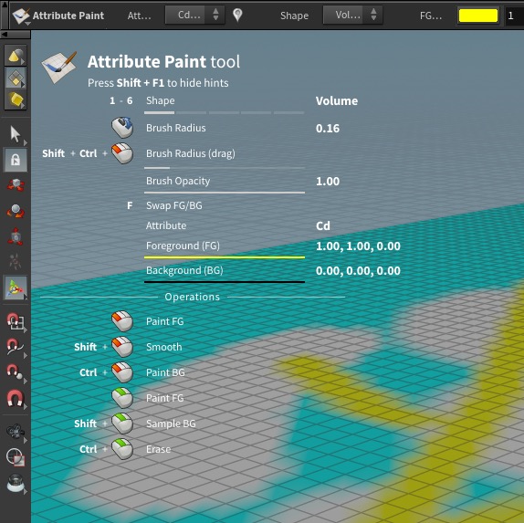
{ "id": "density", "label": "Density", "key": "mousewheel", "value": "0.0" }
divider row
This is a dividing space between “sections” of the panel.
For example:
{ "type": "divider" }
Note
In versions of Houdini before 20.0, the divider was drawn as a line with an optional label. In Houdini 20.0 it was changed to be a blank space.
bargraph row
This appears as a “progress bar” type graph in the label column. Use this to display numeric information (such as “Radius” or “Alpha”).
Currently the value of this must always be from 0.0 to 1.0. Whatever scale or unit the “real” value you want to display is in, you must normalize it before you set it on the bargraph row.
This graph is almost always shown after a “plain” row showing the same information textually. See the style guide below.
|
Optional, float |
The fraction of the bar to fill, from 0.0 - 1.0. |
For example:
{ "type": "bargraph", "id": "alpha_g", "value": 0.25 }
choicegraph row
This row is graphically show the current value of a setting with only a few possible values (for example, the current mode, or the current geometry type). It displays a set of bar segments in the label column. The number of possible choices is specified using the count key in the template. The current value (from 0 to count - 1) controls which segment in the graph is “active”.
This graph is almost always shown after a “plain” row showing the same information textually. See the style guide below.
|
Required, integer |
The number of segments in the graph. |
|
Optional, integer |
The index of the segment that is “active”, from |
For example:
{ "type": "choicegraph", "id": "mode_g", "value": 0 }
group row
This is a special type of “row” which groups together zero or more “sub-rows” so you can show or hide them as a group.
You can switch between a mutually-exclusive set of children by updating "current". Alternatively, you can directly control the visibility of the rows in the group by updating "visible".
See row groups below.
|
List |
List of dictionaries for this group’s sub-rows. |
|
Optional, Integer or string or |
Takes an index into the sub-rows, or the ID of one of the items in |
|
Optional, Boolean |
Whether the items in this group are visible. |
For example:
{
    "type": "group", "id": "mode_pages",
    "rows": [
        ...
    ]
}
Specifying keys 
The key field for a row is a string. It can be made up of the following parts.
-
Single keys (or mouse buttons). For example,
A,5,LMB. -
The following strings are replaced with unicode symbols or graphics:
backspace,del,esc,left,right,up,down,LMB,MMB,RMB,mousewheel. -
Key combos: two or more single keys joined by +. For example
Ctrl + LMB,Ctrl + Shift + A. -
Key range: a “start” and “end” key joined by -. For example
1-3,5-8. -
Alternatives: separate keys/combos/ranges separated by /. For example
E / Shift + E / MMB.
Update values dictionary 
To update the values and/or visibility in the info panel, build an update dictionary and pass it to the hou.SceneViewer.hudInfo method’s hud_values keyword argument.
-
The keys of the dictionary reference the
idstrings for items in the template. -
If the value is scalar (an int, float, or string), it is shorthand to set the row’s
value. -
The value can be a dictionary of one or more keys and values to update specific options on the given row/group. For example, the
"visible"option.
Tip
If your info panel displays values (not just hotkey hints), make sure to keep them up to date. You will usually have to update the info on enter, on resume, and whenever a parameter changes that affects the values (you will usually need to subscribe to parameter changes on the node using hou.OpNode.addParmCallback).
For example:
updates = {
    # Shorthand to directly set the value:
    "shape": self.current_spape_name,
    # This is equivalent to:
    "mode": {"value": self.curent_mode_name},
    # Remember that values are always strings
    "radius": "{:0.3f}".format(self.radius),
    "frozen": "true" if self.is_frozen else "false",
    # Set the visibility of a row or group of rows:
    "tangents": {"visible": self.curve_type == "bezier"},
}
self.scene_viewer.hudInfo(hud_values=updates)
Row groups 
Groups are useful for showing/hiding blocks of rows at a time.
-
Set the “visible” key for a row or group to show or hide it.
-
For a group, you can set the
"current"key to the ID of an item in the group. Only that row/group will be visible, all others in the group will be hidden. This is useful for switching between “pages” of rows.
HUD_TEMPLATE = {
    "title": "Curve", "desc": "tool",
    "icon": "SOP_curve",
    "rows": [
        {
            "id": "mode", "label": "Mode",
            "key": "{}/{}/{}".format(ENTER_EDITMODE_KEY,
                                     ENTER_DRAWMODE_KEY,
                                     ENTER_AUTODRAWMODE_KEY)
         },
        {"id": "mode_g", "type": "choicegraph", "count": 3},
        {"id": "primtype", "label": "Curve Type"},
        {
            # This group lets us switch between different "pages" of
            # hints for the different modes
            "type": "group", "id": "mode_page",
            "rows": [
                {
                    "type": "group", "id": "edit",
                    "rows": [
                        {"label": "Drag entire curve",
                         "key": "Shift + LMB"},
                        {"label": "Insert a point", "key": "Ctrl + LMB"},
                    ]
                },
                {
                    "type": "group", "id": "draw",
                    "rows": [
                        {"label": "Insert a point (on curve)", "key": "Ctrl + LMB"},
                        {"label": "Finish curve", "key": '{}/{}'.format(FINISH_KEY, "MMB")},
                        {"label" : "Drag point (With no curve active)", "key" : "MMB"},
                        {"label": "Align point with previous point (hold)",
                         "key": "Shift"},
                        { "type" : "group", "id": "bezierdraw",
                          "rows" : [
                            {"label": "Draw arc segment (hold)",
                             "key": CIRCLE_SEGMENT_KEY},
                            {"label": "Draw straight line segment (hold)",
                             "key": "Shift + Ctrl"}
                        ]}
                    ]
                },
                {
                    "type": "group", "id": "auto",
                    "rows": [
                        {"label": "Insert a point (on curve)", "key": "Ctrl + LMB"},
                        {"label": "Finish curve", "key": '{}/{}'.format(FINISH_KEY,"MMB")},
                        {"label" : "Drag point (With no curve active)", "key" : "MMB"},
                        {"label": "Click where curve should go"},
                        {"label": "Use more points in curvy areas"},
                        {"label": "Finish curve", "key": FINISH_KEY},
                    ]
                },
            ]
        },
        {
            # This group lets us hide this section for geometry types that
            # don't have tangents
            "type": "group", "id": "tangents",
            "rows": [
                {"type": "divider", "label": "Tangents"},
                {"label": "Set selected point type", "key": "1-3"},
                {"label": "Re-pull tangents (on point)",
                 "key": "Ctrl + LMB"},
                {"label": "Break tangent handle while dragging",
                 "key": "Ctrl"},
                {"label": "Lock tangent direction while dragging",
                 "key": "Shift + Ctrl"},
                {"label": "Snap tangents to 45 degree angles (hold)",
                 "key": "Shift"},
            ]
        },
        {"type": "divider", "label": "Common"},
        {"label": "Show Radial Menu", "key": RADIAL_MENU_KEY},
        {"label": "Toggle Transform Handle", "key": TRANSFORM_TOGGLE_KEY}
    ]
}


# Examples of updating values/visibility:
# Say the "mode" variable contains a string with the current mode (e.g "draw").
# The "mode_num" variable represents the current mode as a number, e.g. 0, 1, or 2.
# The block of tangent hints should only be visible if curve_type is "bezier".
updates = {
    "mode": mode,
    "mode_g": mode_num,
    "mode_page": {"current": mode},
    "tangents": {"visible": curve_type == "bezier"},
}
scene_viewer.hudInfo(hud_values=updates)
Style guide 
-
Do not put “prompts” in the info panel (e.g. “Click points to connect them”, “Select the objects you want to delete”, etc.). These types of messages can still be printed at the bottom of the viewer in the prompt area. The info panel is meant to surface “hidden” functionality and show useful hints/values.
-
You don’t need to document absolutely everything your state can do in the info panel. Only show the commonly useful data/hints.
-
The info panel is not meant to update its contents based on what is under the mouse pointer. It is for “always useful to know” tips/hints/hotkeys. It occupies a relatively large area so if it “animated” based on mouse movements it would be very distracting/annoying.
-
Put indicators for the current “modes” at the top of the stack. For example, if a brush tools has a current “mode” (brush, smooth, erase) and a “space” (world, local, screen), those should be at the top.
-
For a value that is numeric, or a value that represents a choice between a small (fewer than 10) number of alternatives, try to add a “graph” row below the “plain” row to also display the information graphically. Remember that you have to update the both the plain row and the graph row when the value changes.
-
If there’s a key that cycles between modes, set that as the hotkey for the row showing the current mode:
"B". If there is a key to cycle forward and a key to cycle backwards, show them as alternatives:"B / Shift + B". If there are separate keys for each mode, see if they can fit as alternatives:"Q / R / T". If you can’t fit all the keys, consider not showing the keys for each mode, or showing separate key/hint rows for each mode. -
Try to sort the rows so hints with hotkeys come before hints without hotkeys. Intermixing rows with and without hotkeys tends to look messy.
-
Key “ranges” are good for keeping the key column narrow. Normally, you would use them for keys with an obvious sequencing, such as
"1-9", or"F5 - F8". -
Don’t include hints for actions that are common across all tools (for example, the modifier keys to add/remove/toggle selection, or ⌃ Ctrl + A to select all).