| On this page |
Starting a new rig setup 
| To... | Do this |
|---|---|
|
Create a new setup |
Set a character rig to the scene by selecting that character with Alternatively, the node name can be typed into the character text field, or dragged in from the Network Editor. A history of the selected characters is maintained in the drop down menu next to the character text field. |
|
Turn on edit mode |
Click the Tip You can press E to toggle Edit mode on and off. |
|
Add a new view |
|
 button beside an existing tab, select New Tab Type, and select either Single View or Multi View. A Single View will contain one character viewer pane, while a Multi View will contain four panes that can be resized.
 Setting up control buttons 
| To... | Do this |
|---|---|
|
|
Alternatively, you can hold ⌃ Ctrl and click |
|
|
If you have clicked the |
|
|
Click and drag the control when |
|
|
|
Note If the selected controls are already spaced out enough, these options will not do anything. |
|
|
|
|
|
|
|
|
Select multiple controls at once |
|
|
Select individual controls |
Click the control you want to select. |
|
Add to selected controls |
Hold ⇧ Shift and click additional buttons. |
|
Hold ⌃ Ctrl and select the button to remove. |
|
|
Select all controls at once |
Hold ⇧ Shift and click the background. |
|
Hold ⇧ Shift + Alt and click when Note To be mirror button pairs, the buttons must have the same node contents. This means the nodes they contain can only differ in name by the suffixes |
|
|
Change the color of a control. |
|
|
Change the label of a control. |
|
|
Remove a control |
|
If another control button shares any nodes with the button that is currently selected, it will be highlighted, but not selected.
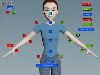
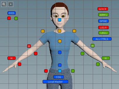
Adding background images 
You can set background images from either the current viewport, an external file, or an image supplied by a URL link.
-
Make sure
 Edit mode is on.
 -
Click the
 the gear menu and select Set Background.
 -
Choose either From Viewport, From File, or From URL.
The images will be saved within the character picker, so there is no need to keep image files or maintain directory continuity.
Note
A Scene View tab must be visible for the background to be set with a viewport image. Additionally, the .hip must be saved and have an associated $HIP directory.
Working in the Character Picker pane 
| To... | Do this |
|---|---|
|
Show/hide the grid |
Tip You can press ⇧ Shift + G to toggle to grid on and off. |
|
Snap to the grid |
Tip You can press ⇧ Shift + S to toggle to grid snapping on and off. |
|
Adjust the size of the grid cells |
|
|
Adjust the snapping gravity of the grid |
Drag the slider or enter a value from |
|
Zoom in/out of the pane |
Use You can also right-click and drag right and/or up to zoom in, and left and/or down to zoom out. |
|
Pan around the pane |
|
|
Automatically zoom to show whole view |
Press Space + H. |
|
Press Space + G. |
Working with multiple characters in a scene 
If you have multiple characters in the scene with identical rigs and wish to use the same layout controls to manipulate both, select the other characters using the  chooser. You can toggle between the characters using the dropdown menu. Whichever character is displayed in the Characters field is the character the controls will be applied to.
Loading and Saving 
Views can be saved to a .json file or directly to the rig’s digital asset. For example, the  Simple Biped character already includes a character picker rig. The view state is stored by using the File ▸ Save Layout menu. Views can be loaded from a digital asset or an external file via File ▸ Load Layout, dragging and dropping its node from the Network Editor into the Character Picker panel or Character text field, or by clicking and selecting your node.
Tip
Press ⌃ Ctrl + S to quick save changes to the place the layout was last saved or originally loaded from.
Note
Only HDA Object nodes can be loaded.
Registering an Event Callback 
def eventCallback(event_type, kwargs):
    if event_type == mainwidget.EventType.ButtonSelected:
        targetPaths = kwargs["targetpaths"]
        # do something
        return True
    elif event_type == mainwidget.EventType.ButtonDeselected:
        targetPaths = kwargs["targetpaths"]
        # do something
        return True
    return False

# Open a character picker
pane_tab = hou.ui.curDesktop().createFloatingPaneTab(
    hou.paneTabType.PythonPanel,
    python_panel_interface="sesi_character_picker")
char_picker = pane_tab.activeInterfaceRootWidget()

# Register the callback
char_picker.registerEventCallback(eventCallback)

# Now, any events will be routed to eventCallback first.
Users can customize the behavior of certain events by registering a callback
with the CharacterPicker. Each event is associated with some EventType. The
following EventTypes are available:
-
ButtonSelectedSignaled whenever a button is selected. Default behavior is to select the nodes targeted by the button.
Key-word arguments:
-
"targetpaths": full paths to the nodes targeted by the button. -
"buttondefaultbehavior": one of cpglobals._PYS_DEF_BEH_* constants. This is called whenever a control button is selected.
-
-
ButtonDeselectedSignaled whenever a button is deselected. Default behavior is to deselect the nodes targeted by the button.
Key-word arguments:
-
"targetpaths": full paths to the nodes targeted by the button.
-
Callback Function 
def eventCallback(event_type, kwargs):
    if event_type == mainwidget.EventType.ButtonSelected:
        targetPaths = kwargs["targetpaths"]
        # do something
        return True
    elif event_type == mainwidget.EventType.ButtonDeselected:
        targetPaths = kwargs["targetpaths"]
        # do something
        return True
    return False
When an event happens, the registered callback is passed 2 arguments: the type of the event, and a dictionary of arguments corresponding to the event.
If the callback returns True, then the default behavior won’t be executed. If
the callback returns False, then the default behavior will be executed after
the callback returns. It may be helpful to think of True as indicating that the
event has finished being processed, and False indicating that the event hasn’t
been fully processed and should be processed further.
If no callback is registered, the default behavior is performed.
For example: the default behavior for a button selection event is that the nodes
assigned to the button are selected. If the registered callback returns
False for the EventType.ButtonSelected event, then the buttons will be selected
after the callback returns. If it returns True, then it’s up to the writer of
the callback to select the nodes if they so choose.