| On this page |
|
Warning
This feature is experimental and subject to change.
Overview 
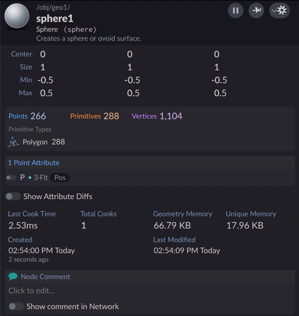
The info window displays information about a node. For example, the info window for a geometry (SOP) node shows the attributes and groups on the geometry generated by the node, and other information. You can display the info window for a node by hovering over the node and then clicking the “i” button in the node ring, or by holding  on the node.
It can sometimes be useful to add extra custom information to the info window for a certain node type or for all nodes. For example:
-
The author of a digital asset might want to display information specific to the asset when the user shows the info window for an instance of the asset.
-
Studios with complex asset management pipelines can display information about each asset specific to their workflow.
There are a few different places you can display custom information in the window:
-
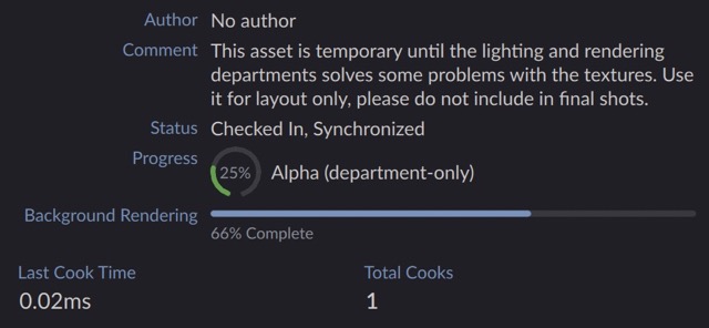
You can add a “tag” at the top of the window, just below the node heading. This is a bit of text inside a pill shape. It is useful for displaying a single bit of information, for example whether an asset is “out of date”.

-
You can add information near the top of the window (under the node header), in the middle (above the general info grid), or near the bottom (above the node comment editor).
Quick start 
-
Create a
$HOUDINI_USER_PREFS/config/CustomNodeInfodirectory. -
In the
CustomNodeInfodirectory, create anindex.jsonfile with the following contents:index.json
{
    "node_scripts": {
        "Sop/sphere": "test.py"
    }
}
-
Then create the
test.pyfile in the same directory with the following contents:test.py
addLabeledText("Custom Message", "This is some custom text for the info window.")
-
Run Houdini. Create a
Geoobject and dive inside. Then create aSpherenode. -
Hovering over the node and click the “i” button in the node ring, or hold
on the node.You should see the custom message in the info window.
See writing a customization script below for more information.
Storing a customization script in an asset 
You can store a customization script in a section (“Extra File”) inside an asset. If an asset has a section called custom_node_info.py, Houdini will automatically run the script when the user shows the info window for an instance of the asset, allowing it to add custom info.
-
In the network editor, right click the asset and choose Edit Type Properties.
-
In the Type Properties dialog, click the Extra Files tab.
-
In the Section Name field, enter
custom_node_info.py, then click Add Empty Section. -
Use the editor on the right side to enter (or paste) the script. See writing a customization script below.
Storing customization scripts in files on the Houdini path 
Houdini looks for any config/CustomNodeInfo/index.json files on the Houdini path. In this file you can specify customization scripts to run for specific node types, or for all nodes.
Tip
If the are multiple config/CustomNodeInfo/index.json files on the path (for example, one in the user’s preferences directory and one in the $JOB directory), Houdini combines them.
Here’s an example of an index.json file:
{
    "node_scripts": {
        "Sop/lsystem": "lsystem.py"
    },
    "general_scripts": [
        "every_node.py"
    ]
}
The JSON can have two optional keys:
node_scripts (object)
An object mapping internal node type names (with category) to script paths. When a user shows the info window an instance of one of the specified node types, it runs the corresponding customization script.
To get the internal node type name with category for a node type, open the Python shell and drag the node into the shell window to create a bit of Python to get a reference to the node, then add .type().nameWithCategory() and press Enter. For example:
>>> hou.node('/obj/copnet1/custom_test1').type().nameWithCategory()
'matt::Cop/custom_test::1.0'
general_scripts (array)
An array of script path strings. Houdini runs each script in this list (in order) when it shows the info window for any node type.
-
node_scriptsdoes not support patterns. Instead, create a general script and have it only add information for certain nodes. For example, to add custom info to any nodes in theacmenamespace, create ageneral_scriptand have the script only add the information ifnamespace == "acme". -
Usually the values of the
node_scriptsobject are path strings. However, you can use an array of path strings if for some reason you want to run multiple scripts for a certain node type.{ "node_scripts": { "Sop/lsystem": "lsystem.py", "Sop/sphere": ["sphere.py", "shape.py"] } }
-
Relative paths are resolved from the directory containing the
index.jsonfile.
Writing a customization script 
Overview 
Tip
Since you’ll often want to add information to middle, the methods on middle are also available as top-level functions. For example, you can say addText("Hello) as a shortcut for middle.addText("Hello").
Variables 
hou: module
The hou module is automatically imported in the script.
node: hou.Node
The node the user is showing the info window for.
node_name: str
The name of the node. This is a shortcut for node.name().
type_name: str
The name of the node’s type. This is a shortcut for node.type().name().
category: str
The name of the node type’s category, for example "Sop", "Dop".
namespace: str
Just the namespace part of the type name. This might be useful if you want to show some info only for nodes in your studio namespace.
basename: str
Just the base name part of the type name.
version: str
Just the version part of the type name.
output_index: int
In certain network types, such as SOPs, the user can press on a node output, or switch the output displayed in the info window. This is the index of the output connector currently shown in the info window. Use this if you are pulling information out of the node’s geometry using hou.SopNode.geometry.
if namespace == "acme" and category == "Sop":
    # Look for extra information stored in a detail attribute and display it
    # in the info window if it exists
    geometry = node.geometry(output_index)
    try:
        value = geometry.attribValue("my_extra_info_string")
    except hou.OperationFailed:
        pass
    else:
        addLabeledText("Extra Information", value)
Tags 
addTag(text: str)
Displays a small bit of text at the top of the info window in a colored pill shape. This can be useful for displaying a small bit of important binary information, such as “Up to Date” or “Deprecated”.
Optional keyword arguments:
color: color
The color of tag body. Use "transparent" to not draw the background. See specifying colors.
textColor: color
Normally Houdini automatically chooses a text/symbol color that is visible against the base color. However you can explicitly set the color with this argument. See specifying colors.
textSize: int
The size (in pixels) of the text font.
symbol: str
The name of a PhosphorIcon to display to the left of the text.
symbolSize: float
If symbol is given, this is the size of the icon. Default is 16.
symbolVariant: str
If symbol is given, this is the variant of the PhosphorIcon. Possible values are "regular" (the default), "bold" (thicker lines), "light" (thinner lines), "thin" (much thinner lines), or "filll" (solid style instead of outline style).
addTag("Synced", color=theme.amber)
addTag("Puppy", symbol="dog")
addTag("Kitteh", symbol="cat")
Container objects 
top, middle, bottom: CustomContainer
The top, middle, and bottom objects represent “insertion points” within the info window layout where you can add information.
-
topis near the top of the window, after any errors/warnings. -
middleis after any node type information (for example, for SOPs, the attributes and groups), and before the grid of general information (cook count, cook time, creation time, and so on). -
bottomis after the grid of general information, above the node comment.
The CustomContainer objects have the following methods:
Container creation methods 
addColumn() -> CustomContainer
Adds a vertical stack layout. The returned object represents the container, so you can call methods on it to add info to the new column. This is usually not necessary, since the default top, middle, and bottom objects are columns, but it might be useful to customize spacing between the items in the column.
Optional keyword arguments:
spacing: float
The spacing between items in the column.
topPadding: float / leftPadding: float / rightPadding: float / bottomPadding: float
Addes space around the contents of the column.
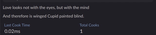
column = middle.addColumn(spacing=10)
column.addText("Love looks not with the eyes, but with the mind")
column.addText("And therefore is winged Cupid painted blind.")
addGrid() -> CustomContainer
Adds a layout that arranges items into a grid of fixed-size cells. The returned object represents the container, so you can call methods on it to add info to the new grid.
Usually you will call the addSimpleTextTile("label", "text") method on the grid to add information.
Optional keyword arguments:
cellWidth: float
The width of cells in the grid. Default is 100.
cellheight: float
The height of cells in the grid. Default is 48, which typically allows a “simple” tile with one line of text.
columnSpacing: float
Horizontal spacing between cells.
rowSpacing: float
Vertical spacing between cells.
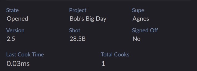
grid = middle.addGrid()
grid.addSimpleTextTile("State", "Opened")
grid.addSimpleTextTile("Version", "2.5")
grid.addSimpleTextTile("Project", "Bob's Big Day")
grid.addSimpleTextTile("Shot", "28.5B")
grid.addSimpleTextTile("Supe", "Agnes")
grid.addSimpleTextTile("Signed Off", "No")
addTile(label: str) -> CustomContainer
Adds a tile with a background and label. The returned object represents the tile contents, so you can call methods on it to add info to the column inside the new tile.
Optional keyword arguments:
backgroundColor: str
The color of the tile background.
labelColor: str
The color of the label text.
labelBackgroundColor: str
The color of the label background.
labelVisible: bool
Whether to show the tile label (and label background).
copyText: str
Normally when the user selects a tile and copies it to the clipboard, Houdini copies any text inside the tile. If you pass this argument, this string is copied to the clipboard instead. This is useful when you want to copy “unformatted” text to the clipboard instead of what’s displayed, for example 12345 instead of 12,345.
See specifying colors.
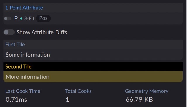
tile1 = addTile("First Tile")
tile1.addText("Some information")
tile2 = addTile("Second Tile", labelColor="#ffcc00",
                labelBackgroundColor="black", backgroundColor="#574D25")
tile2.addText("More information")
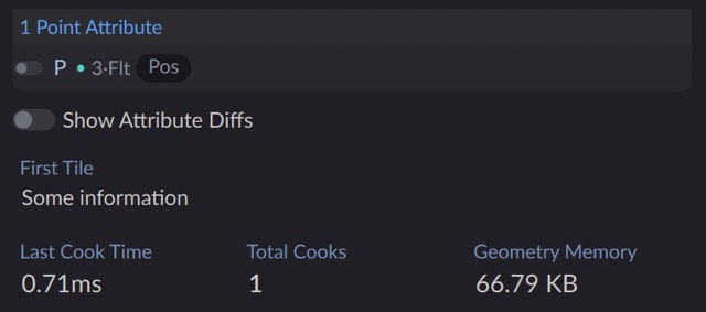
addSimpleTile(label: str) -> CustomContainer
Same as addTile(), but automatically turns off the tile and label backgrounds and reduces margins for a simpler, more compact look.
This takes the same optional keyword arguments as addTile().
tile1 = addSimpleTile("First Tile")
tile1.addText("Some information")
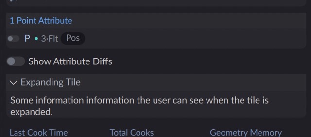
addExpandingTile(label: str, expanded=True) -> CustomContainer
Adds an expanding tile, which allows the user to expand or collapse the items inside the tile. The expanded keyword controls the initial state of the tile.
This takes the same optional keyword arguments as addTile().
tile1 = addExpandingTile("Expanding Tile", expanded=False)
tile1.addText("Some information the user can see when the tile is expanded.")
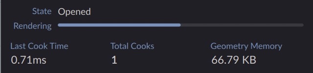
addLabeledColumn(label: str) -> CustomContainer
Like addSimpleTile(), but the label is positioned next to the contents instead of above.
Labeled columns in the same parent container automatically match their label widths.
item1 = addLabeledColumn("State")
item1.addText("Opened")
item2 = addLabeledColumn("Rendering")
item2.addProgress(0.5)
Tip
The addLabeledX() methods below are convenient shortcuts when the column will only have one item.
addLabeledText(“State”, “Opened”) addLabeledProgress(“Rendering”, 0.5)
Item creation methods 
Each addX() method for adding an item of information has a corresponding addLabeledX() method, allowing you to create a table of labeled values. The addLabeledX(label, ...) variants are just shortcuts for addLabeledColumn(label).addX(...).
addText(text: str) / addLabeledText(label: str, text: str)
Adds some text.
Optional keyword arguments:
size: int
The font size, in pixels.
monospaced: bool
Whether to use a monospaced font for the text. Default is False.
color: str
The text color. See specifying colors.
format: str
Controls how the text string is interpreted. auto (the default) tries to guess whether the text is HTML of plain text using heuristics such as whether it has tags. plain displays plain text. rich interprets the string as HTML. markdown inteprets the text as markdown.
symbol: str
The name of a PhosphorIcon to display to the left of the text.
symbolSize: float
If symbol is given, this is the size of the icon. Default is 16.
symbolVariant: str
If symbol is given, this is the variant of the PhosphorIcon. Possible values are "regular" (the default), "bold" (thicker lines), "light" (thinner lines), "thin" (much thinner lines), or "filll" (solid style instead of outline style).
symbolColor: color
If symbol is given, this is the color of the icon. See specifying colors.
spacing: float
The space between the symbol (if any) and the text. Default is 2.
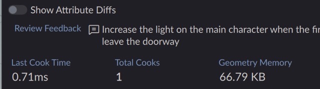
addLabeledText(
    "Review Feedback",
    "Increase the light on the main character when the first leave the doorway",
    symbol="chat-text"
)
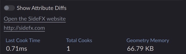
addLink(text: str, link: str = None) / addLabeledLink(label: str, text: str, link: str = None)
If you pass two arguments, they are the text of the link and the link destination. If you only pass one argument, it is used as both the text and destination of the link. For exmaple:
addLink("Open the SideFX website", "http://sidefx.com")
addLink("http://sidefx.com")
-
If the link starts with
http:orhttps:, clicking it opens the URL in an external browser. -
If the link starts with
node:, the rest of the URL should be a path to a node in the scene. Clicking the link selects the node and centers it in the network editor.
Optional keyword arguments:
iconName: str
The name of a Houdini icon to display next to the link. Typically this would come from calling node.type().icon() on a node object. See addNodeLink() below.
iconSource: str
A file: or http: URL specifying a regular image to display as an icon next to the link.
iconSize: float
The size of the icon, if it displayed next to the link. Default is 16.
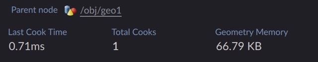
addNodeLink(node: hou.Node) / addLabeledNodeLink(label: str, node: hou.Node)
Ceating a link to a node based on a hou.Node object.
This is a shortcut for addLink(node.path(), f"node:{node.path()}, iconName=node.type().icon()")
parent = node.parent()
addLabeledNodeLink("Parent node", parent)
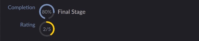
addDonut(value: float) / addLabeledDonut(label: str, value: float)
Creates a “donut” progress graph. value is a number from 0.0 to 1.0.
Optional keyword arguments:
size: real
The width and height of the donut graph. Default is 32.
text: str
Text displayed in the center of the donut. Typically this would be something short like 25%.
description: str
Text is displayed to the right of the graph.
startAngle: real / endAgnle: real
Control the start and end angle defining the graph range. The defaults are -160 and 160, which creates a “speedometer” look that starts at 0.0 on the lower left and goes around to 1.0 on the lower right. To instead show a graph that starts at the top at 0.0 and wraps all the way around to 1.0 back at the top, use startAngle=0, endAngle=360.
clockwise: bool
If True, the arc progresses clockwise. If False, the arc progresses counter-clockwise. Default is True.
arcColor: str
The color of the “filled” arc.
trackColor: str
The color of the “empty” part of the graph. Set this to "transparent" to not show the track.
See specifying colors.
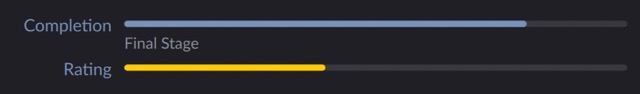
addLabeledDonut("Completion", 0.8, text="80%", description="Final Stage")
addLabeledDonut("Rating", 0.4, text="2/5", startAngle=0, endAngle=360,
                arcColor="#ffcc00")
addProgress(value: float) / addLabeledProgress(label: str, value: float)
Creates a horizontal bar graph. value is a number from 0.0 to 1.0.
Optional keyword arguments:
description: str
Displayed as small text below the bar.
barHeight: real
The height of the bar.
barColor: str
The color of the “filled” part of the bar.
trackColor: str
The color of the “empty” part of the bar. Set this to "transparent" to not show the track.
See specifying colors.
addLabeledProgress("Completion", 0.8, description="Final Stage")
addLabeledProgress("Rating", 0.4, barColor="#ffcc00")
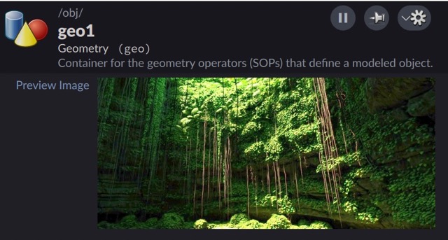
addImage(source: str, animated=False) / addLabeledImage(label: str, source: str, animated=False)
Displays an image. The source string must be a URL, for example a file: or http: URL. (If the image is an animated GIF, use animated=True. Otherwise the image will only display the first frame of the animation.)
Note
The image is loaded and displayed by the Qt user interface library, not Houdini, so unfortunately it can only handle common formats like JPEG and PNG (it cannot display .exr files), and does not properly display OCIO color spaces. If you want to display a rendered image, you can use hoiiotool to create a (possibly scaled-down) sRGB PNG or JPG “thumbnail” of the render and display that.
top.addLabeledImage("Preview Image", "file:///Users/matt/Downloads/Cenote.png")
addCustomItem(url: str | pathlib.Path | QtCore.QUrl, **kwargs)
This allows you to add a custom item defined by a QML source file to the info window. This is not recommended, and QML authoring is beyond the scope of this documentation or Houdini support. You should really try to use the other options above for showing information before exploring using custom QML.
The url argument is a string, Path, or QUrl object pointing to a QML file to instantiate to create the custom item. Relative file paths or file: URLs are resolved relative to the script file currnetly running.
Houdini uses any keyword arguments you pass to set properties on the new item.
Specifying colors 
For arguments that take a color, you can use any of the following values:
-
A hex color string (for example,
"#ffcc00") or a CSS color name (for example,"rebeccapurple"). -
The string
"transparent"to not draw anything. -
A
QtCore.QColorobject. -
Any of the following UI color values (for example,
addTag("Oops!", color=theme.error)):-
theme.success(a shade of green) -
theme.warning(a shade of yellow) -
theme.error(a shade of red) -
theme.primary(the UI accent color) -
theme.secondary(a desaturated versoin of the accent color) -
theme.red,theme.orange,theme.amber,theme.yellow,theme.lime,theme.green,theme.emerald,theme.teal,theme.cyan,theme.sky,theme.blue,theme.indigo,theme.violet,theme.purple,theme.fuchsia,theme.pink,theme.rose,theme.stone,theme.gray,theme.zinc,theme.steel,theme.slate,theme.heather
-
Performance strategies 
Houdini runs all customization scripts serially before the info window becomes available. You should try to make the scripts run as fast as possible so users don’t have to wait for the info window. If gathering the information to display could be slow (for example, getting information across the network), there are a few things you can try to speed it up.
Update asynchronously 
You can try running potentially slow code in an async function, or a Thread, and update the item’s properties when the information becomes available.
To update an item asynchronously, keep a reference to the object returned by the creation method. Then, when the information becomes available, call the update() method on that object, using keyword arguments to set the properties you want to change.
(The following is a simple example. The details of using Python’s async or threading features are beyond the scope of this documentation and not covered by Houdini support.)
import requests
import threading

# Create a text item and set its initial text to a placeholder
status_item = addLabeledText("Status", "--")

# Get information through an HTTP request in a thread
def threaded_fn():
    response = requests.get("api.example.com/status")
    # Once the information is available, update the item with the new text
    status_item.update(text=response.text)
threading.Thread(target=fn).start()
Note
Functions/methods that add or remove items do not work after the info window is displayed. To “remove” a custom item aysnchronously, use item.update(visible=False) to hide it.
Update on demand 
For information that takes a long time to retrieve, you could also consider adding a button to the info window, and only if the user clicks the button, the script retrieves the slow information and updates the window. This could be useful for information that’s only needed occasionally, since the user can decide when to pay the cost of getting the info.
To implement this, add a button and a hidden display item. In the callback function for the button, retrieve the information, update the display item with the new information and show it. You can optionally hide the button if it’s only meaningful to retrieve the information once, or leave it visible if the information might want to update it more than once.
def get_status_callback(button):
    response = requests.get("api.example.com/status")
    # Get references to the button and text by their IDs
    button = findByID("status_button")
    text_item = findByID("status_text")
    # Hide the button
    button.update(visible=False)
    # Set the new text and show it
    text_item.update(text=response.text, visible=True)

# Create a labeled column to hold the button and status readout
column = addLabeledColumn("Status")
# Add the button and readout to the column
column.addButton("Get", get_status_callback, id="status_button")
# The text readout is hidden until the user clicks the button and the
# callback function loads the information
column.addText("", id="status_text", visible=False)
Cache information in the background 
You could try having some kind of background process that updates slow information and caches it, and then have the info window display the cached information.
Merging information from separate scripts 
If you have multiple customization scripts adding information (for example, a studio-wide script, a node-type specific script, and a general script in the user’s prefs), you may want to have different scripts add items to the same container.
To share containers between scripts, add an id argument to methods that create a new container, such as addGrid() or addLabeledColumn(). Use the same ID in different scripts to get the same container.
For example, if two scripts have the following code:
script1.py
c1 = addLabeledColumn("Comments", id="comments")
c1.addText("Comment from script1")
script2.py
c2 = addLabeledColumn("Comments", id="comments")
c2.addText("Comment from script2")
…the result will be a single Comments column containing two items (Comment from script1 and Comment from script2`).
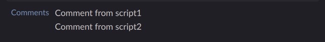
If you didn’t have the id argument, the two scripts would create two separate columns, both labeled Comments, with one item in each.

You can also use the following utility functions in customization scripts if necessary to work with containers.
findByID(id: str) -> CustomContainer | None
Returns the container with the given ID, if it exists.
findByLabel(label: str) -> CustomContainer | None
Returns the first container with the given label, if it exists.
removeByID(id: str)
Removes the container with the given ID, if it exists.
removeByLabel(label: str)
Removes any items with the given label, if they exist.
Tips and notes 
-
You can use
nodeobject in the script to access parameter values and user data stored on the node. See the hou.Node object reference. -
The info window checks the modification times of the index files and scripts and reloads them if they've changed. You don’t need to restart Houdini to pick up changes to the files.
-
If you don’t see the results of your script when you open the info window, do the following:
-
Check the console for error messages.
-
If the script is in a file on disk, double-check that it’s listed in an
config/CustomNodeInfo/index.jsonfile on the Houdini path. -
If it’s a node-specific script, make sure the key in the
index.jsonfile matches the “internal name with category” of the node type exactly.
-
-
Customization scripts should run quickly so the info window isn’t slow to open. If you want to get information from the network to display in the info window, consider strategies such as using async or threading, or getting the information in the background and caching it until the user displays the info window.
-
If you just want to display some HTML, you can use
addText()and pass a string of HTML as the “text”. It uses Qt’s “rich text” widget which supports a subset of HTML 4 and CSS 2 but is definitely not as capable as a real browser. -
Avoid only displaying information through color (for example, a tag that always says “Status” but is green for normal status and red for error status). Use color to reinforce information displayed as text and/or symbols.
-
Try to avoid building a lot of interaction into the info window. It is really meant to let the user quickly check information about a node, not serve as a “command interface”. Remember that when the user displays it by holding
, they can’t interact with the info window at all.