| On this page |
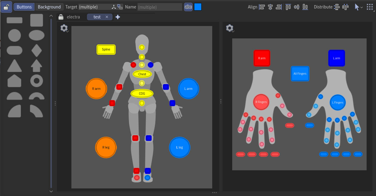
In the character picker, animators can create a 2D layout with simple buttons to select character controls in an animation scene. The picker layout is created in the character picker pane, where you can add images, buttons, and labels to create a custom layout for a character. The character picker pane is active when you are in the animate state. If you are outside the animate state, the character picker pane will be empty.
For information on setting up for the character picker and how to create a picker layout, see the character picker page.
When you enter the animate state, the character picker pane will be in  pick mode or
  edit mode, indicated by the icon on the top toolbar. In pick mode, the pane is locked and the picker layout cannot be modified. In edit mode, the pane is unlocked for editing, and you can drag buttons and images from the catalog onto the canvas.

You can work within two different layers in edit mode - the background layer and the button layer:
Background layer
In the background layer, you can add images to the canvas that act as a guide for placing buttons. For example, if you are creating a picker layout for a biped character or a character’s hands, you could use biped or hand shapes as the background image.
To switch between the two layers, click the appropriate layer button on the top toolbar. Each layer has a distinct set of toolbar options.
Within each layer, you can have multiple views. Add a view by clicking  above the canvas. Duplicate or rename a view by
  clicking the tab.
You can also split a view into multiple sections by selecting Split View Left/Right or Split View Top/Bottom from the canvas' context menu.
Hotkeys 
In the table below, an “element” is a button, image, or label.
| To... | Do this |
|---|---|
|
Pan |
or Hold Space and drag |
|
Zoom in and out of the canvas |
Do one of the following:
|
|
Frame the canvas |
Press F. |
|
Pan and zoom to show the selected elements |
Press Space + G. |
|
In the button layer, hold ⌃ Ctrl and click on the canvas to place the button at the mouse position. |
|
|
Select the button and press N. |
|
|
Select all the elements |
⇧ Shift click the canvas. |
|
Resize the elements |
Hold ⇧ Shift and drag to keep the element centered while resizing. Hold ⌃ Ctrl and drag a corner of the element to keep the aspect ratio. |
|
Move an element along the x or y axis |
Hold ⌃ Ctrl while dragging. |
|
Select two buttons and press S. |
|
|
When using Add Button per Control or Add Button per Selection Set, press L while dragging to toggle between placing the buttons in a line or a grid. |
|
|
Lay out the elements in a grid |
Select the elements and press L. |
|
Toggle snapping to other elements on the canvas |
Press ⇧ Shift + X. This toggles the Snap to Items option. |
|
Snap to 15 degree increments when rotating an element |
Hold ⌃ Ctrl while rotating. |


Toolbar 
The following options on the top toolbar are common to both the button layer and background layer.
Toolbar Options |
Description |
|---|---|
|
|
Buttons |
Enters the button layer and displays the button layer options on the toolbar. |
Background |
Enters the background layer and displays the background layer options on the toolbar. |
Align |
Aligns the selected elements:
|
Distribute |
Evenly spaces the selected elements:
|
|
Select elements using Box Select or Lasso Select. |
|
See the menu options. |
 Align on the left
 Center horizontally
 Align on the right
 Align at the top
 Center vertically
 Align on the bottom
 Evenly space the elements vertically
 Evenly space the elements horizontally
 Select Mode
 Menu 
The following options are available from the  menu on the top toolbar.
Menu Option |
Description |
|---|---|
Import Layout |
Imports a picker layout, overwriting the current layout. |
Import Layout as New Tabs |
Appends a picker layout to the existing layout as new tabs. |
Export Current Tab |
Saves the current picker tab to disk as a .json file. |
Export All |
Saves all the picker tabs to disk as a .json file. |
Duplicate Tab |
Makes a copy of the current tab. |
Create from Rig |
Creates buttons from the selected controls in the rig. |
Replace Characters in Selected Buttons |
For the selected buttons, replaces the button’s target character(s) with another character. For example, if a button originally targeted a particular character’s head control, this option replaces the character so that the button now targets another character’s head control. |
Replace Characters in Current Tab |
Replaces a character or multiple characters with another character in the current tab. All the buttons that targeted the original character now target another character. |
Replace Characters in All Tabs |
Replaces a character or multiple characters with another character in all the tabs. All the buttons that targeted the original character now target another character. |
Show Target Controls in Tooltips |
When turned on, displays a tooltip when hovering over the button that lists the button’s target controls. |
Button layer 
The following options on the top toolbar are available in the button layer.
Toolbar Option |
Description |
|---|---|
Target |
The control(s) associated with the button. |
|
Changes the controls associated with the button:
|
|
Changes the controls associated with the button:
|
Name |
The name of the selected button. |
|
Toggles visibility of the selected button name. |
|
Click to change the color of the selected button. |
 Set from Viewport Selection
  Edit Target Controls
  Show/Hide Button Name
  Button Color
 Background layer 
The following options on the top toolbar are available in the background layer.
Toolbar Option |
Description |
|---|---|
Canvas |
The canvas size. |
|
Enters an interactive mode for resizing the canvas. |
|
Click to change the color of the canvas background. |
Text |
The label text. |
|
The font size of the label. |
|
Click to change the color of the selected label. |
 Resize Canvas
 Font Size
 Context menus 
Context menus can be brought up by clicking a button, image, label, or the canvas.
Canvas 
The following menu options are available when you click the canvas as well as from the  menu on the top left of the canvas:
Menu Option |
Description |
|---|---|
Add Button |
Adds a button at the mouse position. If a control or multiple controls were selected in the viewport, the added button targets the selected control(s). If no controls were selected, the added button is not associated with any control. This option is available in the button layer. |
Add Button per Control |
Adds a button for each selected control in the viewport. For example, if 5 controls were selected, this adds 5 buttons. Click the canvas, then move the mouse to lay out the buttons. While positioning the buttons, press L to toggle between placing the buttons in a line or a grid. This option is available in the button layer. |
Add Button per Selection Set |
Adds a button for each selected selection set. For multiple selection sets, click the canvas, then move the mouse to lay out the buttons. While positioning the buttons, press L to toggle between placing the buttons in a line or a grid. This option is available in the button layer. |
Add Image |
Adds an image from disk. This option is available in the background layer. |
Add Image from Viewport |
Adds a snapshot of the viewport. This option is available in the background layer. |
Add Image from URL |
Adds an image from a URL. This option is available in the background layer. |
Add Label |
Adds a label at the mouse position. This option is available in the background layer. |
Fit Canvas to Contents |
Resizes the canvas to fit the images, buttons, and labels on the canvas. This option is available in the background layer. |
Show Grid |
When turned on, shows a grid on the canvas to aid in positioning elements. |
Snapping |
Options to help with aligning elements on the canvas. Snap to Items When turned on, elements snaps to other elements on the canvas. Snap to Grid When turned on, elements snap to the grid lines. This option is available when Show Grid is turned on. Grid Options Gravity - The strength of snapping to the grid. Grid Cell Size - The size of the grid squares. |
Selection |
Options when selecting multiple elements: Group Results in a single group selection for all the selected elements. Individual Results in individual selections for each of the selected elements. Preserve Button Sizes When turned on, the When turned off, the |
Split View Left/Right |
Splits the view into left and right views. |
Split View Top/Button |
Splits the view into top and bottom views. |
Delete View |
Deletes the selected view (after the view was previously split). |
 Scale button sizes mode is automatically selected on the top left corner of the button selection. When you drag a corner of the button selection, both the button sizes and button spacing are scaled.
 Button 
The following menu options are available when you click a button in the button layer.
Tip
You can click the top line in the button’s context menu to tear off the menu into its own window. You can also tear off the submenus under the Shape, Size, and Layout options.
Menu Option |
Description |
|---|---|
Edit Target Controls |
Opens a window where you can select the character and control(s) that the button targets. |
Set from Viewport Selection |
Sets the button’s target control(s) to the selected control(s) in the viewport.
|
Add from Viewport Selection |
Adds the selected control(s) to the button’s target controls.
|
Replace Characters |
Replaces the button’s target character(s) with another character. |
Edit Name |
Sets the name of the button. |
Show Name |
When turned on, displays the button name. |
Edit Color |
Opens a color picker window to set a color for the button. |
Default Behavior |
Sets the transform handle mode for the target control when the button is selected. |
Shape |
Sets the shape of the button. |
Size |
Sets the size of the button. Fit to Name Resizes the button to fit the button name. Set to Minimum Resizes the button to the minimum button size. Match Size If multiple buttons are selected, the buttons are resized to the last-selected button. |
Layout |
If multiple buttons are selected, this submenu provides options for aligning (Align Left, Align Center Horizontally, Align Right, Align Top, Align Center Vertically, Align Bottom) and spacing out (Distribute Vertically, Distribute Horizontally) the buttons. These options are also available on the top toolbar. There is also an Arrange in Grid option, which lays out the buttons in a grid. |
Reset Rotation |
Resets the orientation of a rotated button. |
Swap Positions |
If two buttons are selected, this swaps the position of the buttons. |
Mirror Button |
Creates a button that targets the control on the other side of the rig. For example, if a button for the left hand is selected, Mirror Button creates a button that targets the right hand. |
Show Controls |
Displays the button’s target controls in the viewport. |
Hide Controls |
Hides the button’s target controls in the viewport. |
Delete |
Deletes the button. |
Image 
The following menu options are available when you click an image in the background layer. At the bottom of the context menu is a View section that has the same options as the canvas' context menu. They are available here in case the canvas is covered by other elements.
Menu Option |
Description |
|---|---|
Scale to Canvas |
Resizes the image to fit the canvas. |
Set Canvas Size from Image |
Resizes the canvas to fit the image. |
Bring to Front |
Sets the image to be on top of overlapping images. |
Send to Back |
Sets the image to be on the bottom of overlapping images. |
Flip Horizontal |
Flips the image horizontally. |
Flip Vertical |
Flips the image vertically. |
Reset Rotation |
Resets the orientation of a rotated image. |
Duplicate Image |
Makes a copy of the image. |
Delete Image |
Deletes the image. |
Label 
The following menu options are available when you click a label in the background layer. At the bottom of the context menu is a View section that has the same options as the canvas' context menu. They are available here in case the canvas is covered by other elements.
Menu Option |
Description |
|---|---|
Edit Text |
Edits the label text. |
Delete Label |
Deletes the label. |
| See also |


