| On this page |
In the character picker, animators can create a 2D layout with simple buttons to select character controls in an animation scene. The character picker includes various tools for creating and customizing a picker layout for a rig.
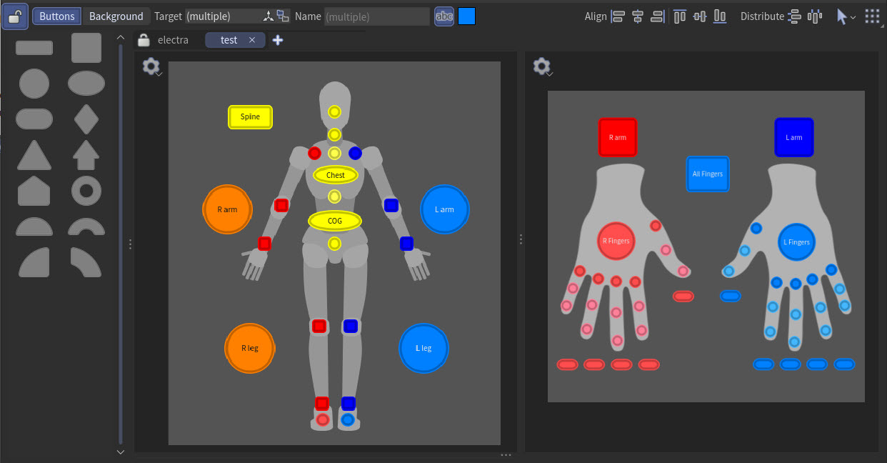
The picker layout is created in the character picker pane, where you can add images, buttons, and labels to create a custom layout for a character. The character picker pane is active when you are in the animate state. If you are outside the animate state, the character picker pane will be empty.
Setup 
You can create a character picker layout in two ways - using an  APEX Add Character Picker SOP or directly in an animation scene. Both methods save the picker layout in a .pick file in the character folder structure.
Create a layout using an APEX Add Character Picker SOP 
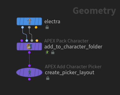
In this example, we create a picker layout for the  Electra test geometry using an APEX Add Character Picker SOP:
-
On the Electra SOP, set Output to Skin Surface. This outputs Electra’s shape as its 1st output and Electra’s skeleton as its 2nd output.
-
The
 APEX Pack Character SOP adds Electra’s shape and skeleton to a character folder structure. Turn on Add FK and Bone Deform Components to create a rig for the character with FK and bone deform functionality.
 We now have character elements at the root of the character folder structure. See the folder structure in the rig tree view - in the rig tree view, set Type to Packed Folders:
/
-- Base.rig
-- Base.shp
-- Base.skel
...
-
The input to the APEX Add Character Picker SOP must be a character folder structure with a
.rigfile at the root. When you create a layout using the APEX Add Character Picker SOP, the SOP adds a picker layout named<rig_name>.pickto the character folder structure. We can see this in the rig tree view:/ -- Base.pick -- Base.rig -- Base.shp -- Base.skel ...
-
Enter the APEX Add Character Picker viewer state, which is a read-only version of the animate state - select the APEX Add Character Picker SOP, turn on its display flag, and click
 Animate on the left toolbar. Once you enter the viewer state, the parameter editor is replaced with the character picker pane.
 You can also use the standalone character picker pane - click the
 New Tab icon at the top of a pane and select New Pane Tab Type ▸ Animation ▸ APEX Character Picker.
Create a layout in an animation scene 
In this example, we create a picker layout for the Electra test geometry directly in an animation scene:

-
As in the previous example, pipe the Electra SOP into an APEX Pack Character SOP to pack Electra’s character elements into a character folder structure. On the APEX Pack Character SOP, turn on Add FK and Bone Deform Components.
-
The
 APEX Scene Add Character SOP adds the character elements to a character (.char) folder in the character folder structure. This character is then added to an animation scene. Specify a name for the character in the Character Name parameter. In this example, we set Character Name to
 electra. -
Enter the animate state - select the
 APEX Scene Animate SOP, turn on its display flag, and click Animate on the left toolbar.
 -
Open the character picker pane - click the
New Tab icon at the top of a pane and select New Pane Tab Type ▸ Animation ▸ APEX Character Picker. Once you start editing the picker layout, the layout will be saved as a
scene.pickfile at the root of the character folder structure. We can see this in the rig tree view:/ -- electra.char/ -- Base.rig -- Base.shp -- Base.skel -- scene.pick
Note
A picker layout that is created in an animation scene can reference multiple characters and props.
Character picker pane 
When you enter the animate state, the character picker pane will be in  pick mode or
  edit mode, indicated by the icon on the top toolbar. In pick mode, the pane is locked and the picker layout cannot be modified. In edit mode, the pane is unlocked for editing, and you can drag buttons and images from the catalog onto the canvas.

Note
If you already have a picker layout for the character (either created upstream using an APEX Add Character Picker SOP or already embedded in the character like the Electra and Otto test geometries), the tabs from the upstream layout will be greyed out and cannot be edited.
You can work within two different layers in edit mode - the background layer and the button layer:
Background layer
In the background layer, you can add images to the canvas that act as a guide for placing buttons. For example, if you are creating a picker layout for a biped character or a character’s hands, you could use biped or hand shapes as the background image.
To switch between the two layers, click the appropriate layer button on the top toolbar. Each layer has a distinct set of toolbar options.
Within each layer, you can have multiple views. Add a view by clicking above the canvas. Duplicate or rename a view by  clicking the tab.
You can also split a view into multiple sections by selecting Split View Left/Right or Split View Top/Bottom from the canvas' context menu.
Create the background 
In the background layer, you can change the size of the canvas, and add images and labels to the picker layout.
-
Click the Background button on the top toolbar to go to the background layer.
-
To set the canvas size:
-
Type in the Canvas field on the top toolbar.
or
-
Click
 on the top toolbar and drag the canvas to resize it. Hold ⇧ Shift and drag to keep the canvas centered while resizing. Hold ⌃ Ctrl and drag a corner of the canvas to keep the aspect ratio. Click again to exit canvas resize mode.
-
-
Drag and drop from the image catalog onto the canvas.
-
Labels are text that you can add to the canvas:
-
To add a label, drag
 from the catalog onto the canvas.
 -
To update the label text, double-click the label, or change the Text field on the top toolbar. You can also change the font size and the label color from the top toolbar.
-
Add buttons 
In the button layer, you can add buttons to the canvas that link to controls on the character rig.
-
Click Buttons on the top toolbar to go to the button layer.
-
Buttons link to controls on the character rig. If you select a button, its associated (target) control will be selected in the viewport. To add a button:
-
Select a control or multiple controls in the viewport, then drag and drop from the button catalog onto the canvas. The created button will target those controls.
-
If you drag and drop from the button catalog onto the canvas without first selecting any controls in the viewport, the created button will not target any controls.
-
You can also select a button from the button catalog, hold ⌃ Ctrl, and click on the canvas to place the button at the mouse position.
To add multiple buttons:
-
Select multiple controls in the viewport (the selection order is important),
click the canvas, and select Add Button per Control. Click the canvas, then move the mouse to lay out the buttons. While positioning the buttons, press L to toggle between placing the buttons in a line or a grid. The buttons are laid out in the order the controls were selected in the viewport. Add a button for each control
-
-
You can also create buttons that select selection sets:
-
Select the selection set(s).
-
click the canvas and select Add Button per Selection Set.
-
Click the canvas, then move the mouse to lay out the buttons. While positioning the buttons, press L to toggle between placing the buttons in a line or a grid. Each button selects one of the selection sets.
-
-
To change a button’s target control, do one of the following:
-
Select the button, select the new control(s) in the viewport, and click
 beside Target on the top toolbar of the character picker pane.
 -
Select the button, click
 beside Target, and in the window that pops up, select the new control(s) and click Accept.
 -
click a button and select Edit Target Controls. In the window that pops up, select the new control(s), and click Accept.
-
Select the new control(s) in the viewport,
click a button, and select Set from Viewport Selection or Add from Viewport Selection.
-
Create buttons from character controls 
You can quickly create a set of buttons based on the character’s controls. In this example, we create buttons for a character’s finger controls:
-
In the viewport, select the finger controls for the left hand.
-
On the top toolbar of the character picker pane, click
 and select Create from Rig.
 -
In the Create from Rig window that pops up, set Controls to Selected and Projection to Right.
-
Click Create Buttons. The finger buttons are projected onto the canvas.
-
Drag a corner of the button selection to change the spacing between the buttons. If you want to keep the button sizes the same, select
 Preserve button sizes mode on the top left corner of the button selection.
 Change the button spacing to fit the hand image -
Mirror the buttons to the other hand - select all the finger buttons,
click one of the buttons, and select Mirror Button.
Test the picker layout 
To test the picker layout, exit edit mode by clicking on the top toolbar. The icon indicates that you are in pick mode.
Test the layout to make sure the buttons select the expected controls in the viewport. Hold ⇧ Shift to select multiple buttons, and ⌃ Ctrl to deselect buttons.
Import and export a picker layout 
Character picker layouts are saved as .pick files in the character folder structure. If the picker layout is created using an APEX Add Character Picker SOP, the layout is saved as <rig_name>.pick. If the layout is created in an animation scene, it is saved as scene.pick. The scene.pick can reference multiple characters.
You can also import and export picker layouts to and from disk as .json files (use the import/export options in the menu on the top toolbar).
Example picker layouts 
The Electra and  Otto test geometries have a character picker layout embedded in their character folder structures:
-
Put down an Electra or Otto SOP in the network editor.
-
Set Output to APEX Scene.
-
Enter the animate state - select the SOP, turn on its display flag, and click
Animate on the left toolbar. -
Open the character picker pane to see the picker layout for the character. Drag the three dots on the side and bottom of the view to see additional layouts. The top right layout is for the character’s ragdoll:

Otto’s picker layout
Hotkeys 
In the table below, an “element” is a button, image, or label.
| To... | Do this |
|---|---|
|
Pan |
or Hold Space and drag |
|
Zoom in and out of the canvas |
Do one of the following:
|
|
Frame the canvas |
Press F. |
|
Pan and zoom to show the selected elements |
Press Space + G. |
|
In the button layer, hold ⌃ Ctrl and click on the canvas to place the button at the mouse position. |
|
|
Select the button and press N. |
|
|
Select all the elements |
⇧ Shift click the canvas. |
|
Resize the elements |
Hold ⇧ Shift and drag to keep the element centered while resizing. Hold ⌃ Ctrl and drag a corner of the element to keep the aspect ratio. |
|
Move an element along the x or y axis |
Hold ⌃ Ctrl while dragging. |
|
Select two buttons and press S. |
|
|
When using Add Button per Control or Add Button per Selection Set, press L while dragging to toggle between placing the buttons in a line or a grid. |
|
|
Lay out the elements in a grid |
Select the elements and press L. |
|
Toggle snapping to other elements on the canvas |
Press ⇧ Shift + X. This toggles the Snap to Items option. |
|
Snap to 15 degree increments when rotating an element |
Hold ⌃ Ctrl while rotating. |


How-to 
In the table below, an “element” is a button, image, or label.
| To... | Do this |
|---|---|
|
Add a view |
Click |
|
Rename or duplicate a view |
|
|
Reorder the views |
Drag the tab. |
|
Delete a view |
Click |
|
Split a view into multiple sections |
or Click |
|
Resize the canvas |
In the background layer, do one of the following:
|
|
Change the background color of the canvas |
On the top toolbar of the background layer, click the color chip beside |
|
Add an image or label |
In the background layer:
|
|
In the button layer:
|
|
|
In the button layer:
|
|
|
In the button layer:
|
|
|
In the button layer:
|
|
|
In the button layer:
|
|
|
In the button layer, do one of the following:
|
|
|
In the button layer, do one of the following:
|
|
|
In the button layer, drag another button shape from the catalog onto the button. |
|
|
In the button layer, select the button and click the color chip on the top toolbar. or
|
|
|
|
|
In the button layer:
|
|
|
For example, if you have buttons that target a particular character’s controls, and you want those buttons to target another character’s controls:
|
|
|
Select elements |
On the top toolbar, click Hold ⇧ Shift to select multiple buttons. Hold ⌃ Ctrl to deselect buttons. |
|
Select all the elements |
⇧ Shift click the canvas. |
|
Delete elements |
Press ⌦ Del or ⌫ Backspace. For buttons, For images, For labels, |
|
Resize elements |
To resize an element:
Resizing options for buttons:
Resizing options for images:
|
|
Lay out elements |
Select multiple elements and do one of the following:
|
|
Use a grid to help position elements |
|
|
Snap elements to the grid or other elements |
|
|
Rotate an element |
Drag the circle above the element: 
Hold ⌃ Ctrl while rotating to snap to 15 degree increments. To reset the rotation, |
|
Flip or duplicate an image |
In the background layer, |
|
Move an image to the front or back |
In the background layer, |
|
Change a label’s text, font, or color |
|
|
Click |
 on the tab.
 on the top left of the canvas, and select Split View Left/Right or Split View Top/Bottom.
 on the top toolbar.
 , and select Box Select or
  Scales the spacing and size of the elements.
| See also |