| On this page |
Blend shapes allow you to morph or blend between geometries that have the same topology. They can be used to create and animate character deformations like facial expressions and muscle bulges. On this page, we walk through how to set up blend shapes, create custom sliders for the blend shape rig component, and drive different blend shapes using a surface.
Set up blend shapes 
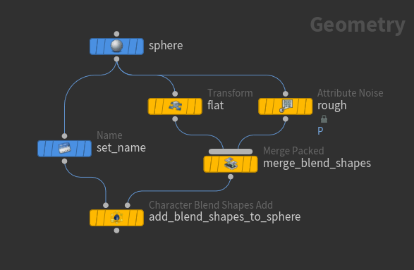
We start with a  sphere and add blend shapes to the sphere’s mesh:
-
We use the
 Transform SOP and
  Attribute Noise SOP to create the blend shapes: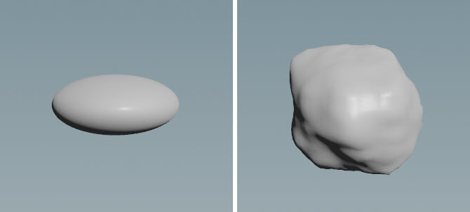
Flat blend shape (left), rough blend shape (right) -
Name the mesh and blend shapes:
-
The
 Name SOP is used to name the sphere. Specify a name in the Name parameter, for example,
 mesh. -
The
 Merge Packed SOP names, packs, and merges the blend shapes. Specify a name for each of the blend shapes in the Name parameters.
-
-
The
 Character Blend Shapes Add SOP adds the blend shapes to the sphere’s mesh. In the Skin Name parameter, specify the name of the sphere’s mesh to apply the blend shapes to (set in the Name SOP).
Add character elements to a character folder structure 
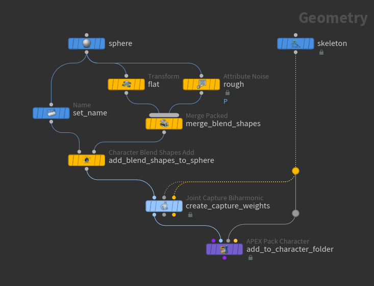
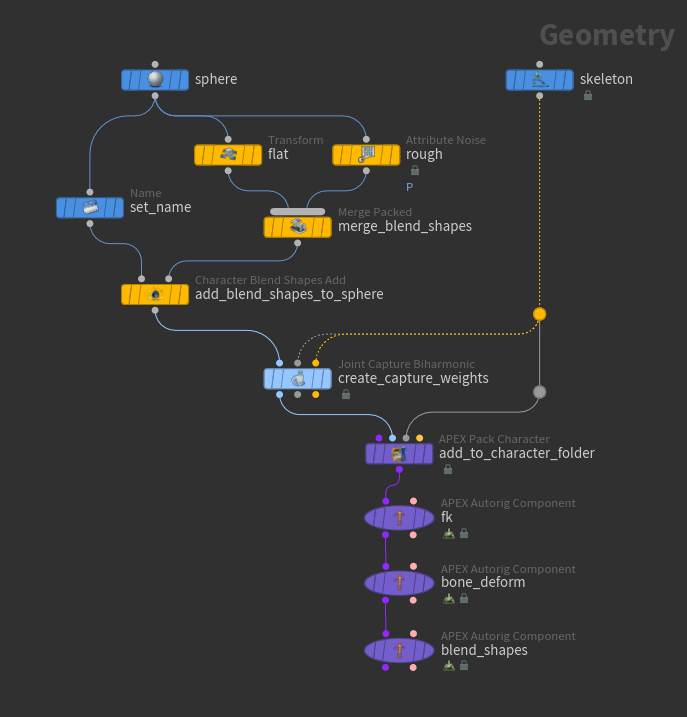
We now create a skeleton and capture weights for the sphere, and add these elements to a character folder structure, the input format for the rig components downstream:
-
We use the
 Skeleton SOP to create a single joint in the middle of the sphere geometry: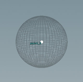
-
The
 Joint Capture Biharmonic SOP creates captures weights on the sphere for deformation.
 -
The
 APEX Pack Character SOP adds the shape and skeleton to a character folder structure. Turn on Add FK and Bone Deform Components, which creates a rig that contains an FK hierarchy for all the joints as well as bone deformation functionality.
Blend shape rig component 
We now add blend shape functionality using the blend shape rig component:
-
On the
 APEX AutoRig Component SOP, set Component Source to Blendshape.
 -
Change the size, shape, length, and position of the blend shape sliders:
-
Slider size - in the Shape tab, set the Scale parameter.
Note
Depending on the size of the geometry, the sliders may be very small in comparison. If you cannot initially see the sliders, try increasing the slider size.
-
Slider control shape - in the Shape tab, set the Shape parameter.
-
Slider length - in the Settings tab, Sliders section, the second field of the Size parameter.
-
Distance between the sliders (if there are multiple sliders) - in the Settings tab, Sliders section, the first field of the Size parameter.
-
Slider’s offset from the rig - in the Settings tab, Sliders section, Offset parameter.
Tip
If Use Click and Drag in the viewport state parameters window is turned off, you need to first select the slider control, then drag to see the effects of the blend shape being applied. If Use Click and Drag is turned on, you can click and drag the slider control in one step.
-
Create custom sliders 
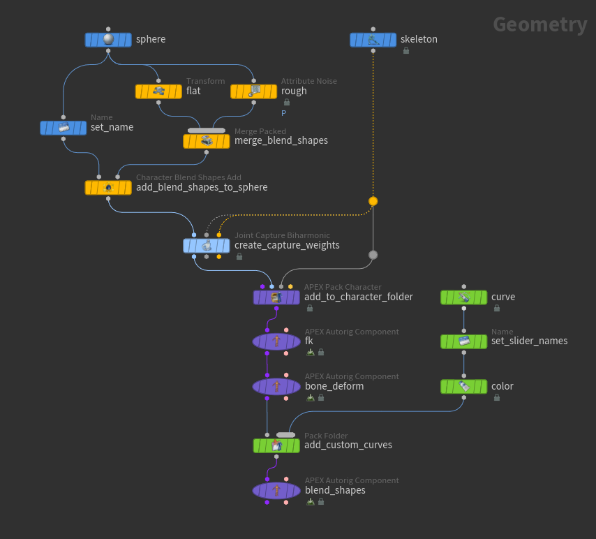
You can create custom blend shape sliders by creating curves with the same name as the blend shapes they control. In this example, we create curves and add them to the character folder structure to be picked up later by the blend shape rig component. The sliders must be primitive shapes.
-
On the
 Curve SOP, create curves for the custom sliders. Turn on the Sphere SOP’s template flag so you can see where to draw the curves in relation to the sphere: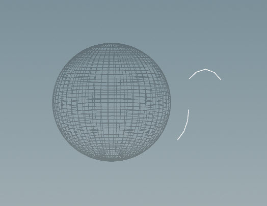
Slider curves -
Specify names for the curves using the
Name SOP:-
Set Class to Primitive.
-
Click
 beside Number of Namings to add a set of parameters for each curve:
-
Select
 beside Group.
 -
In the viewport, select a curve and press Enter over the viewport. The Group parameter will be populated with the number of the curve.
-
Set the Name parameter to the name of the blend shape it will control. The blend shape names were set in the Merge Packed SOP upstream.
-
-
-
Add the curves to the character folder structure using the
 Pack Folder SOP:
-
Name the curves
Sliders.shp- set Name toSlidersand Type toshp. This is the default slider geometry name specified in the blend shape rig component (APEX AutoRig Component SOP, Settings tab, Sliders section, Slider Geo parameter).
Note
If you don’t name the curve geometry with a
.shpextension in the character folder structure, they won’t show up when viewing the blend shapes in the APEX AutoRig Component SOP. -
-
Select the APEX AutoRig Component SOP, turn on its display flag, and click
 Animate on the left toolbar:
 -
At this point, the curves are not parented to the sphere. To parent the curves, go to the Parent tab in the APEX AutoRig Component SOP and set Root to the sphere control (find the sphere control name in the selection sets).
Unparented sliders Parented sliders
Single slider drives different blend shapes 
In this example, we create a slider that blends between two different blend shapes. We start with the following base shape:

The slider blends between the following two blend shapes:

We use a network similar to the previous example:

-
See the previous sections on how to set up blend shapes, populate the character folder structure, and use the blend shape rig component.
-
On the
Curve SOP, create a curve for the slider: 
Slider curve -
On the
Name SOP, specify a name for the slider control. In our example, we set Name to mouth_control.Note
In the previous example, each slider controlled one blend shape, so the sliders were named according to the blend shape it controlled. In this example, the slider blends between two different blend shapes, so we give it a different name from the blend shape names.
-
Define how the slider blends between the two blend shapes by settings properties on the slider. On the
 Attribute Adjust Dictionary SOP:
-
Set Attribute Name to
properties. -
Set Attribute Class to Detail.
-
For each blend shape, there must be two entries in the
propertiesdictionary with the following key-value pairs:-
key:
shp:<blend_shape_name>, value:<slider_control_name> -
key:
uv:<blend_shape_name>, value: Vector2 that specifies the UV range of the slider control
Click
beside Number of Entries to add the following dictionary entries:Key
Type
Value
shp:stretch
String
mouth_control
uv:stretch
Vector2
(-1, 0)
shp:narrow
String
mouth_control
uv:narrow
Vector2
(1, 0)
-
-
-
Add the slider to the character folder structure using the
Pack Folder SOP:-
Name the curves
Sliders.shp- set Name toSlidersand Type toshp. This is the default slider geometry name specified in the blend shape rig component (APEX AutoRig Component SOP, Settings tab, Sliders section, Slider Geo parameter).
-
-
Select the APEX AutoRig Component SOP, turn on its display flag, and click
Animate on the left toolbar:Slider blends between different blend shapes
If there are blend shapes added to the geometry whose values aren’t specified in the Attribute Adjust Dictionary SOP, the blend shape rig component creates default sliders for the extra blend shapes:

Patch sliders 
You can use a NURBS surface to drive different blend shapes. We call this surface a patch. In this example, we start with the following base shape:
We use a patch to blend between the following blend shapes:

We use a network similar to the previous example:

-
See the previous sections on how to set up blend shapes, populate the character folder structure, and use the blend shape rig component.
-
We create a patch using a
 Grid SOP and ray the grid onto the sphere geometry using a
  Ray SOP. The
  Visibility SOP turns off visibility of the patch when viewing the blend shape functionality in the APEX AutoRig Component SOP downstream.
Blend shape patch -
In the
Name SOP, specify a name for the control that slides along the patch. In our example, we set Name to mouth_control. -
Define how the patch slider blends between the different blend shapes. On the
Attribute Adjust Dictionary SOP:-
Set Attribute Name to
properties. -
Set Attribute Class to Detail.
-
For each blend shape, there must be two entries in the
propertiesdictionary with the following key-value pairs:-
key:
shp:<blend_shape_name>, value:<slider_control_name> -
key:
uv:<blend_shape_name>, value: Vector2 that specifies the UV range of the slider control
Click
beside Number of Entries to add the following dictionary entries:Key
Type
Value
shp:stretch
String
mouth_control
uv:stretch
Vector2
(-1, 0)
shp:narrow
String
mouth_control
uv:narrow
Vector2
(1, 0)
shp:up
String
mouth_control
uv:up
Vector2
(0, 1)
shp:down
String
mouth_control
uv:down
Vector2
(0, -1)
-
The four corners of the patch are associated with different blend shapes.
-
-
Transfer the capture weights from the geometry onto the patch slider so that if you move the geometry, the patch slider deforms with the geometry. On the
 Attribute Transfer SOP:
-
Turn off Primitives.
-
Turn on Points and set it to
boneCapture.
Note
These capture weights are only used if Bone Deform Sliders on the blend shape rig component is turned on. See the steps below.
-
-
Add the patch slider to the character folder structure using the
Pack Folder SOP:-
Name the curves
Sliders.shp- set Name toSlidersand Type toshp. This is the default slider geometry name specified in the blend shape rig component (APEX AutoRig Component SOP, Settings tab, Sliders section, Slider Geo parameter).
-
-
Select the APEX AutoRig Component SOP, turn on its display flag, and click
Animate on the left toolbar:Patch slider To see the patch, turn on the bypass flag on the Visibility SOP.
-
At this point, the patch slider doesn’t move with the geometry. To have the patch slider deform with the geometry:
-
On the
APEX Pack Character SOP, set Translate Group to *. This gives you access to the translate component of the head joint. -
On the APEX AutoRig Component SOP, Settings tab, turn on Bone Deform Sliders.
Patch slider is stationary Patch slider moves with the geometry Below is another example of a patch slider deforming with the geometry (this requires additional setup to add the jaw functionality):
Patch slider is stationary Patch slider moves with the geometry -
Screen space sliders 
In the previous examples, 3D sliders were displayed next to the character in the animation scene, so you have to keep the sliders visible in the viewport to have access to them while you animate. Screen space sliders, on the other hand, are accessed through a flat 2D panel that stays locked to the viewport like a HUD, regardless of how you zoom or tumble around in the scene. Screen space sliders always face you and have a fixed screen size, and they drive the same blend shape channels as 3D sliders.
In this example, we build blend shape sliders for a facial rig, creating single, dual, and 2D patch sliders, and a screen space slider panel. This is a more advanced example, but it uses the same slider concepts as custom sliders, single sliders, and patch sliders.

This example demonstrates how to build blend shape sliders for a facial rig using the blend shape rig component.
To create screen space sliders for a facial rig:
-
Draw slider curves and create a patch for the left side of the face:

Slider curves and patch on one side of the face -
Configure the sliders by giving them colors and a
propertiesdictionary that maps each blend shape to a slider (see the single slider and patch slider examples). Mirror the sliders to the other side of the face:
3D slider curves and patches drawn next to the face -
Use a
Curve SOP to create a 2D screen space layout. This layout is separate from the 3D sliders, so you can arrange the screen space curves without affecting how the 3D sliders are displayed in the scene. Note
Each screen space layout curve must have the same name as its corresponding 3D slider curve so that the blend shape component can match them up.
You can simply create a flat two-point curve for each slider because the blend shape component only reads the front-facing start and end positions of each curve. For patch sliders, give them a box shape so that the blend shape component can draw a 2D box for them.

Screen space layout curves -
Use a
Pack Folder SOP to add the 3D slider curves and screen space layout curves to the character folder structure. On the Pack Folder SOP:-
Set the name of the 3D slider curves. In our example, we name the curves
Sliders.shp, so we set Name toSlidersand Type toshp. -
Set the name of the screen space layout curves. In our example, we name the curves
Sliders_proxy.shp, so we set Name toSliders_proxyand Type toshp.
See assembling data for more information on naming elements in the character folder structure.
-
-
On the
APEX AutoRig Component SOP, set Component Source to Blendshape. In the Settings tab, Sliders section:-
Set Slider Geo to the name of the 3D slider curves,
Sliders.shp. -
Turn on Use Screen Space Sliders.
-
Set Screen Space Sliders to the name of the screen space layout curves,
Sliders_proxy.shp. -
The Screen Space Pixel Size sets the overall size of the panel in pixels. The screen space layout is scaled to fit this size, so a larger value creates a larger panel.
-
-
Choose a background image for the panel. For a facial rig, use a picture of a face so that you can place each slider next to the feature it controls.
Use a PNG file with an alpha channel. This allows you to have a background image where the desired shape is opaque while the rest of the image is transparent. In this way, the viewport can show through the transparent areas and not be covered up with an opaque rectangle. The image below is an example background image where the transparent areas are shown as a checkerboard:

PNG background image Tip
You can generate a background image from curves using COPs. Draw the outline of the face and its features as curves, and rasterize them into a
.pngfile that you can use as the background image. The result is a background that matches the character. Because you already have the screen space slider curves as a starting point, building matching background curves is quick, and they automatically line up with the sliders.In the image below, the screen space slider layout is drawn over the face outline curves that feed into COPs. Reusing the layout curves as a starting point keeps the generated background aligned with the sliders:

Screen space layout drawn over face outline curves -
Set the background image - on the APEX AutoRig Component SOP, Settings tab:
-
Set Background Image to a
.pngfile.Note
Start the path of the background image with
\$HIP, not$HIP, so that the path is relative to the scene file. A$HIPpath without the preceding “\” is expanded to an absolute path when the path is baked into the rig, and this could cause issues if you move or share the scene. -
Use the Background Scale parameter to resize the image relative to the sliders.
-
Use the Background Offset parameter to move the image until it lines up with the slider layout.
The image below shows a background face image with slider controls and patch boxes:

Screen space slider panel -
-
Select the APEX AutoRig Component SOP, turn on its display flag, and click
Animate on the left toolbar. The 3D slider curves are displayed next to the character’s face. Each slider is a colored line (or box for patch sliders) with a round peg you can drag:
3D slider curves and patches -
Click the
 menu for the blend shape component and turn on the
 boxlayoutoption. The 3D sliders are replaced with the 2D screen space panel:Switch to the screen space slider panel To move the whole panel, drag the “O” button at the bottom left of the screen space panel. To go back to the 3D slider curves, click the “X” button at the bottom left of the screen space panel, or turn off the
boxlayoutoption in the menu.
How-to 
| To... | Do this |
|---|---|
|
Display specific blend shapes |
On the blend shape rig component ( |
|
Change the name of the character mesh to add blend shapes to |
On the blend shape rig component (APEX AutoRig Component SOP), Settings tab, Blend Shape section, set Skin Name to the name of the character mesh. Make sure this name matches the Skin Name in the |
| See also |