| On this page |
With large and complex scenes, it’s often difficult to isolate specific primitives or object groups. To overcome this limitation, you can define so-called expansion states in the Scene Graph Tree. Expansion states let you precisely control the visibility of a scene’s elements. You can, for example, display polygon-heavy parts only as bounding boxes or make certain parts of a scene completely invisible. Expansion states let you do this in a convenient and intuitive way - and you can even save important states and restore them at any time.
Note
The Scene Graph Tree expansion states support bounding boxes. Note that this display mode works with any composition arc, not just payloads.
Example scene 
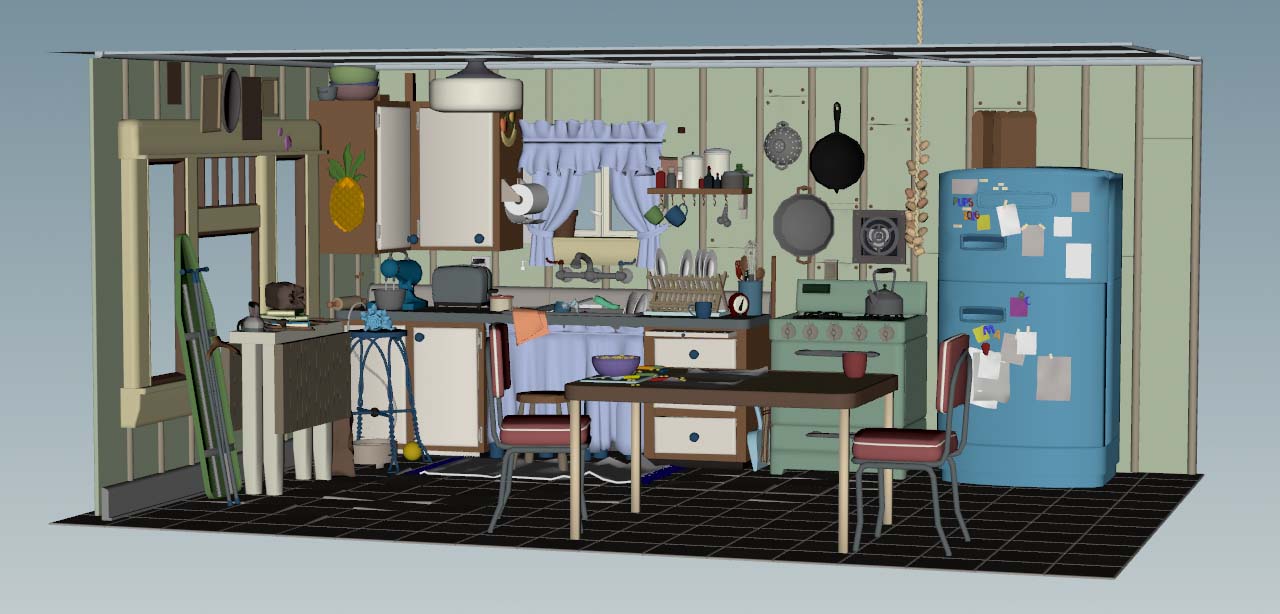
The following descriptions are based on Pixar’s free Kitchen Set USD scene. You can download the example directly from the official Universal Scene Description website. When you confirm the End User License Agreement (EULA) with OK, you’ll directly download a 2.6 MB ZIP file. Expand the ZIP to a directory of your choice and launch Houdini.
Note
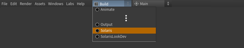
All references to UI elements in this chapter are based on Houdini’s Solaris desktop. To apply this desktop, go to the main menu bar, open the first dropdown menu (set to Build by default) and choose Solaris or Solaris LookDev.
In Houdini, create a File LOP. The node asks whether you want to load the kitchen file as Sublayer or Reference. For this example, the composition arc is not relevant and you can proceed with Sublayer.
In Houdini, the default axes setup uses Y as the height axis. This is the reason why the kitchen might appear tilted. To fix that, go to the main menu and click Edit ▸ Preferences. From the menu, choose 3D Viewports.
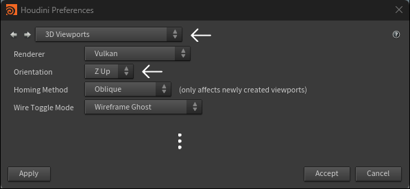
On the panel, change Orientation to Z Up. Click Accept and the orientation of the kitchen will change immediately.
Scene Graph Tree 
When you look at the Scene Graph Tree’s top icon bar you can see a  button. Click the button to open a context menu. You can also access this menu from the Display toolbar’s
  Object type visibility button. The menu’s default choice is Do nothing and the scene will look and behave as you know it.
Bounding Box Draw Mode 
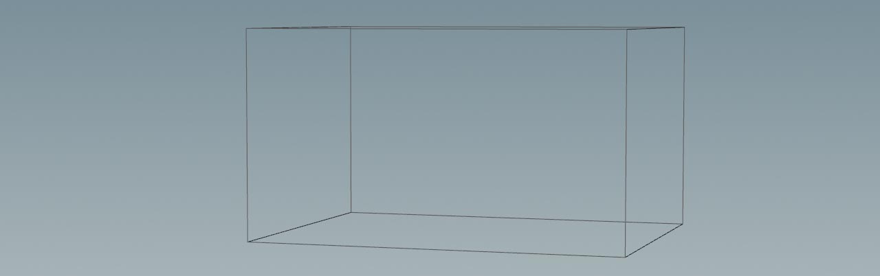
From the context menu, choose Bounding Box Draw Mode. What you get is just one box instead of the kitchen. The bounding box mode is normally more informative than the Visibility mode, because you can at least see where your objects are located. The flip side is that bounding boxes don’t work with every render delegate when you render a scene inside the viewport. For example, with Karma you’ll always get the full scene setup. The corresponding Visibility states, however, are considered by Karma.
Note
Technically, the bounding box states change the USD draw mode and this is something you're able to do before with the Draw Mode function’s Bounding Box option. But, the new system is much more comfortable.
To see the Draw Mode column, go to the Scene Graph Tree. There, click the  icon and turn on the appropriate checkbox.
When you expand the Kitchen_set entry in the Scene Graph Tree, you get more bounding boxes until you reach a primitive that has a component kind. Only components are drawn as actual objects.
Visibility 
The Visibility mode works in the same way as the Bounding Box Draw Mode. You can even switch from box to visibility and vice versa while the current expansion state will be maintained.
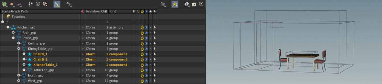
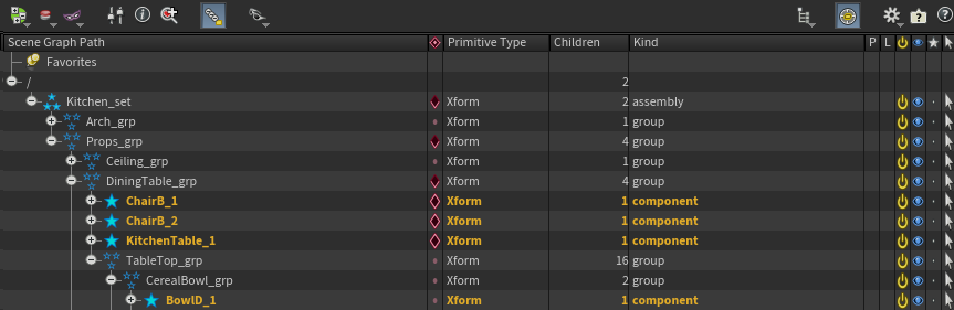
In the image above you can see the components of the DiningTable_grp. When you turn on Visibility, the boxes of the higher-ranking groups disappear. Only the chairs and the kitchen table are visible now:

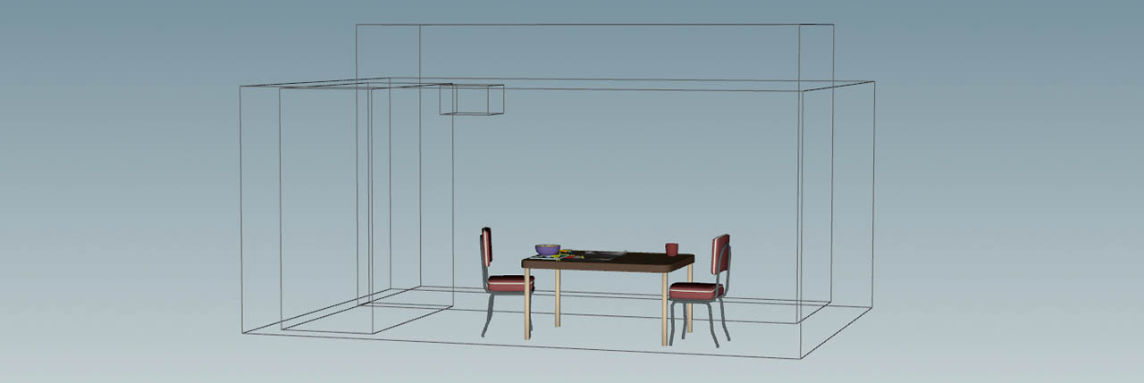
There’s also a TableTop_grp, but it’s invisible, because it’s not a component kind. However, when you expand this group, you’ll see its components in the viewport as well.
States column 
Expanding and collapsing the Scene Graph Tree is certainly a quick and reliable method if you want to control the visibility/bound box state for a couple of objects. The flip side is that you most probably end with lots of objects you actually don’t want to see. The solution lies in the Scene Graph Tree’s column with the diamond-shaped  icon. This column lets you lock the expansion effect as if the Scene Graph Tree was in a particular state - like a “snapshot”.
Icons 
Icons play an important role and they change their shape according to the current expansion state. The following table shows all possible icons and what they mean:
| Icon | Description | |
|---|---|---|
| 1 |
|
Indicates that one or more descendant branches have a locked state. |
| 2 |
|
Even if this locked branch is hidden or collapsed, it acts as if it were expanded. |
| 3 |
|
Even if a locked branch is expanded, it acts as if it were collapsed. |
| 4 |
|
The branch is unlocked. |
| 5 |
|
Indicates that an ancestor of a primitive is locked. The primitive behaves as if it were collapsed (see technical information below). |
| 6 |
|
Indicates that an ancestor of a primitive is locked. The primitive behaves as if it were collapsed (see technical information below). |
Technical information icons 5 and 6
In these cases, the actual expansion of the primitive with this icon will be ignored, because the ancestor’s locked state will override the expansion state in the tree. The difference between icons #5 and #6, and icons #2 and #3 in the table above is just a matter of where the “lock” was actually applied: on this primitive itself, or an ancestor primitive. This distinction affects where you need to click to clear the lock state.
Locked states 
Let’s start with a basic example in Bounding Box Draw Mode.
From the Props_grp branch, open the DiningTable_grp group. You can now see the chair and table components, while all the other items are displayed as boxes. This is exactly how you would expect it from the descriptions above.
Now,  -click the icon of the
 DiningTable_grp group. You’ll notice that several icons have changed their state - they're locked. When you collapse the branches, the locked state of the table and its chairs will be maintained. The button/icon you've pressed in the column makes the affected items appear as if they're expanded.
-
The new
icon on the Kitchen_setandProps_grpindicates that these branches contain at least one locked expansion state. -
The
DiningTable_grpitself has a icon that tells you that this is the group with the locked state.
To resolve a locked state, -click on again. Chairs and table are displayed as bounding boxes like the rest of the scene.
Shift-click state 
The diamond icon has even more functionality, because it also supports ⇧ Shift-click actions that let you control the visibility of an entire group or even the complete scene. Let’s use the DiningTable_grp branch once more. You might remember that you can display the objects as shaded items by expanding the branch. Once you collapse the branch, the items are shown as bounding boxes again. Shift-clicking is basically the same as Expand to Components from the Scene Graph Tree’s right-click menu.
Now, ⇧ Shift + -click the DiningTable_grp group’s icon. Icons and viewport obviously look exactly the same as with a single -click, but there’s a fundamental difference:
-
With a single
-click, you've only locked the state of the three components. -
The ⇧ Shift +
-click, however, also affects the TableTop_grpand reveals several more items on the table. Generally speaking, this action expands the tree down to components and then locks it.
You can also unlock the state with another single -click. In this case, all items will be displayed as bounding boxes like before.
You can now see a bowl and other objects from TableTop_grp on the previously empty table.
Ctrl-click state 
If you have read the state column’s tooltip already, you might have seen that there’s also a ⌃ Ctrl + -click option that lets you fully hide a complete branch. To see the effect of this action, set the mode to Visibility. The kitchen should be invisible now and the expansion state for all branches is .
Tip
If you can still scene parts of the kitchen, make sure that the Arch_grp and Props_grp are collapsed.
-
To make the kitchen visible, ⇧ Shift +
-click the icon of the kitchen_setgroup. -
Expand
Props_geoand ⌃ Ctrl +-click the state icon of the DiningTable_grp. The icon changes to and all items of the table group are now hidden. When you collapse the tree, the table and its parts remain invisible.

Component states 
So far we've only been looking at groups which finally affected their associated components. Of course, you can also change the expansion states/visibility of a component itself. By default, a component is displayed when it’s expanded.
Take another look at the DiningTable_grp. You can lock it with a single -click to see all of its items - including TableTop_grp as if they're expanded. Now you only want to see TableTop_grp, but the chair and table components should be drawn as bounding boxes. The ⌃ Ctrl-click “shortcut” makes this possible.
-
Select the three components and ⌃ Ctrl +
-click their diamond icons. The branch will now be treated as collapsed and you can draw bounding boxes even though the components are exposed.
Tip 
With complex scenes, it can happen that you want to avoid that certain parts are displayed, because they take very long to show up in the viewport. In such a case it can make sense to lock the top level (here: Kitchen_set) with a ⌃ Ctrl + -click. This hides all branches even if they're expanded - including components:

Then you can go through the branches and make only those primitives visible you want to work on. The rest remains invisible or will be drawn as bounding boxes.
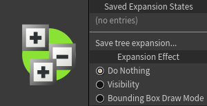
Saving expansion states 
The Expansion States dropdown menu lets you save and restore an expansion state.
-
Define an expansion state.
-
Click the
button. -
From the dropdown menu, choose Save tree expansion…
-
Enter a name or short description to the new panel’s input field and click OK.
The saved state will also appear on the dropdown menu under Saved Expansion States and provides its own context menu. From this menu you can Load or Delete the saved state. Another function is to override the saved state with the current state of your scene. To do this, choose Replace With Current State.